Step 5: Drill down into the details
In the last step you discovered that Tennessee, North Carolina, and Florida have negative profit. To find out why, you decide to drill down even further and focus on what's happening in those three states alone.
Pick up where your map view left off
As you saw in the last step, maps are great for visualizing your data broadly. A bar chart will help you get into the nitty-gritty. To do this, you create another worksheet.
-
Double-click Sheet 3 and name the worksheet Profit Map.
-
Right-click Profit Map at the bottom of the workspace and select Duplicate . Name the new sheet Negative Profit Bar Chart.
-
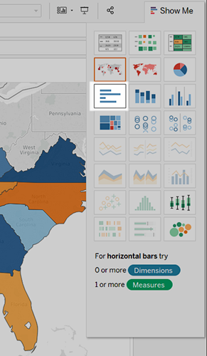
In the Negative Profit Bar Chart worksheet, click Show Me, and then select horizontal bars.
Show Me highlights different chart types based on the data you've added to your view.
Note: At any time, you can click Show Me again to collapse it.
-
To select multiple bars on the left, click and drag your cursor across the bars between Tennessee, North Carolina, and Florida. On the tooltip that appears, select Keep Only to focus on those three states.
Note: You can also right-click one of the highlighted bars, and select Keep Only.
Notice that an Inclusions field for State is added to the Filters shelf to indicate that certain states are filtered from the view. The icon with two circles on the field indicates that this field is a set. You can edit this field by right-clicking the field on the Filters shelf and selecting, Edit Filter.
-
On the Rows shelf, click the plus icon on the State field to drill-down to the City level of detail.
You now have a bar chart again—just like that.
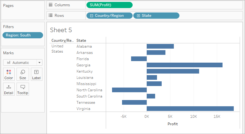
Now you want to look at the data for the cities in these states.
There’s almost too much information here, so you decide to filter the view down to the cities with the most negative profit by using a Top N Filter.
Check your work! Watch steps 1-5 in action
Click the image to replay it
Create a Top N Filter
You can use a Top N Filter in Tableau Desktop to limit the number of marks displayed in your view. In this case, you want to use the Top N Filter to hone in on poor performers.
-
From the Data pane, drag City to the Filters shelf.
-
In the Filter dialog box, select the Top tab, and then do the following:
-
Click By field.
-
Click the Top drop-down and select Bottom to reveal the poorest performers.
-
Type 5 in the text box to show the bottom 5 performers in your data set.
-
Click OK.
-
Extract Filters
-
Data Source Filters
-
Context Filters
-
Top N Filters
-
Dimension Filters
-
Measure Filters
-
On the Filters shelf, right-click the City field and select Add to Context.
The City field turns gray and moves to the top of the Filters shelf, but nothing changes in the view. So even though you're forcing Tableau to filter City first, the issue isn't resolved.
-
Click Undo.
-
On the Filters shelf, right-click the Inclusions (Country, State) (Country, State) set and select Add to Context.
The Inclusions (Country, State) (Country, State) set turns gray and moves to the top of the Filters shelf. And bars have returned to your view!
You're on to something! But there are six cities in the view, including Jacksonville, North Carolina, which has a positive profit. Why would a city with a positive profit show up in the view when you created a filter that was supposed to filter out profitable cities?
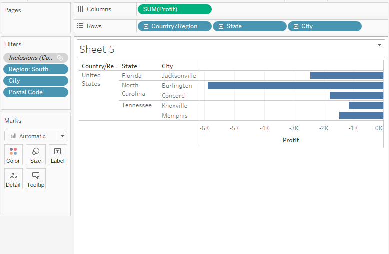
Jacksonville, North Carolina is included because City is the lowest level of detail shown in the view. For Tableau Desktop to know the difference between Jacksonville, North Carolina, and Jacksonville, Florida, you need to drill down to the next level of detail in the location hierarchy, which, in this case, is Postal Code. After you add Postal Code, you can exclude Jacksonville in North Carolina without also excluding Jacksonville in Florida.
-
On the Rows shelf, click the plus icon on City to drill down to the Postal Code level of detail.
-
Right-click the postal code for Jacksonville, North Carolina, 28540, and then select Exclude.
-
Drag Postal Code off the Rows shelf.
Tableau Desktop has already selected a field (Profit) and aggregation (Sum) for the Top N Filter based on the fields in your view. These settings ensure that your view will display only the five poorest performing cities by sum of profit.
![The Top tab of the Filter [City] dialog box that is set to By field: Bottom 5](Img/Explore12.png)
What happened to the bar chart, and why is it blank? That's a great question, and a great opportunity to introduce the Tableau Order of Operations.
The Tableau Order of Operations, also known as the query pipeline, is the order that Tableau performs various actions, such as the order in which it applies your filters to the view.
Tableau applies filters in the following order:
The order that you create filters in, or arrange them on the Filters shelf, doesn't change the order in which Tableau applies those filters to your view.
The good news is you can tell Tableau to change this order when you notice something strange happening with the filters in your view. In this example, the Top N Filter is applied to the five poorest performing cities by sum of profit for the whole map, but none of those cities are in the South, so the chart is blank.
To fix the chart, add a filter to context. This tells Tableau to filter that field first, regardless of where it falls on the order of operations.
But which field do you add to context? There are three fields on the Filters shelf: Region (a dimension filter), City (a top N filter), and Inclusions (Country, State) (Country, State) (a set).
If you look at the order of operations again, you know that the set and the top N filter are being applied before the dimension filter. But do you know if the top N filter or the set filter is being applied first? Let's find out.
Postal Code is added to the Filters shelf to indicate that certain members in the Postal Code field have been filtered from the view. Even when you remove the Postal Code field from the view, the filter remains.
Your view updates to look like this:
Check your work! Watch steps 1-8 in action
Click the image to replay it
Now that you've focused your view to the least profitable cities, you can investigate further to identify the products responsible.
Identify the troublemakers
You decide to break up the view by Sub-Category to identify the products dragging profit down. You know that the Sub-Category field contains information about products sold by location, so you start there.
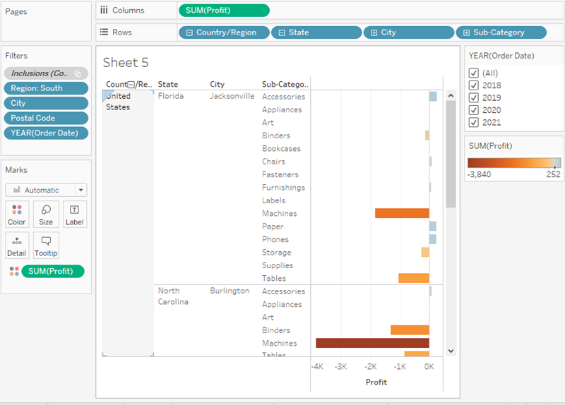
- Drag Sub-Category to the Rows shelf, and place it to the right of City.
-
Drag Profit to Color on the Marks card to make it easier to see which products have negative profit.
-
In the Data pane, right-click Order Date and select Show Filter.
You can now explore negative profits for each year if you want, and quickly spot the products that are losing money.
Machines, tables, and binders don’t seem to be doing well. So what if you stop selling those items in Jacksonville, Concord, Burlington, Knoxville, and Memphis?
Verify your findings
Will eliminating binders, machines, and tables improve profits in Florida, North Carolina, and Tennessee? To find out, you can filter out the problem products to see what happens.
-
Go back to your map view by clicking the Profit Map sheet tab.
-
In the Data pane, right-click Sub-Category and select Show Filter.
A filter card for all of the products you offer appears next to the map view. You'll use this filter later.
-
From the Data pane, drag Profit and Profit Ratio to Label on the Marks card. To format the Profit Ratio as a percentage, right-click Profit Ratio, and select Format. Then, for Default Numbers, choose Percentage and set the number of decimal places you want displayed on the map. For this map, we'll choose zero decimal places.
Now you can see the exact profit of each state without having to hover your cursor over them.
-
In the Data pane, right-click Order Date and select Show Filter to provide some context for the view.
A filter card for YEAR(Order Date) appears in the view. You can now view profit for all years or for a combination of years. This might be useful for your presentation.
-
Clear Binders, Machines, and Tables from the list on the Sub-Category filter card in the view.
Recall that adding filters to your view lets you include and exclude values to highlight certain parts of your data.
-
Select (All) on the Sub-Category filter card to include all products again.
As you clear each member, the profit for Tennessee, North Carolina, and Florida improve, until finally, each has a positive profit.
Click the image to replay it
Hey, you made an interesting discovery!
Binders, machines, and tables are definitely responsible for the losses in Tennessee, North Carolina, and Florida, but not for the rest of the South. Do you notice how profit actually decreases for some of the other states as you clear items from the filter card? For example, if you toggle Binders on the Sub-Category filter card, profit drops by four percent in Arkansas. You can deduce that Binders are actually profitable in Arkansas.
You want to share this discovery with the team by walking them through the same steps you took.
You found that binders, machines, and tables were responsible for the negative profit in Tennessee, North Carolina, and Florida. What now?
You can continue exploring the data by answering the questions below. Note: If you use your view to explore these questions, undo any changes before continuing the Get Started tutorial.
-
How are machine sales in Tennessee, North Carolina, and Florida? Are you selling a lot? If so, how is profit impacted?
-
What other factors might be contributing to these results? Are retailers in the south selling products at a discount?
-
What about table and binder sales?
-
What happens to sales in Jacksonville, Miami, Burlington, Knoxville, and Memphis when you remove either machines, tables, or binders?
-
But what about bookcases? Remember, in Step 2, we saw that bookcases were very unprofitable in other regions. Digging into those regions might reveal additional solutions.
Check your work! Watch "Verify your findings" in action
Click the image to replay it
Now you know that machines, tables, and binders are problematic products for your company. In focusing on the South, you see that these products have varying impacts on profit. This might be a worthwhile conversation to have with your boss.
Next, you'll assemble the work you've done so far in a dashboard so that you can clearly present your findings.
More on working with maps and geographic roles in the Learning Library (in the top menu).