Create Heatmaps that Show Trends or Density in Tableau
You can create maps in Tableau that reveal patterns or relative concentrations that might otherwise be hidden due to overlapping marks on a map. One common map type for this is a density map, also called a heatmap. Tableau creates density maps by grouping overlaying marks and color-coding them based on the number of marks in the group.
Density maps help you identify locations with greater or fewer numbers of data points. They are most effective when working with a data set containing many data points where there’s substantial overlap between the marks on the map.
Your data source
To create a density map, your data source should contain point geometry, latitude and longitude coordinates, or location names (if recognized as location names by Tableau).
Tableau can recognize location names and create a density map using the point locations assigned to Tableau geocoding locations, but density maps are most effective when the location data is very precise, such as location coordinates in a limited space. Density marks work best where the specific locations change continuously and smoothly across space, rather than values constrained to discrete locations like borough or neighborhood.
Basic map building blocks:
| Columns shelf: | Longitude (continuous dimension, longitude geographic role assigned) |
| Rows shelf: | Latitude (continuous dimension, latitude geographic role assigned) |
| Detail: | One or more fields with many underlying data points |
| Mark type: | Density |
Build the map view
You can choose Density from the mark type drop-down and Tableau will compute a density surface on your view. The density surface recomputes as you zoom or filter data on the remaining marks. When using Pages or a small multiples view, the Density is computed across the full domain of the data for comparative analysis.
To follow along with this example, download the Create Heatmaps in Tableau Example Workbook(Link opens in a new window) (click Download in the upper right hand corner), and open it in Tableau Desktop.
-
Open a new worksheet and connect to your data source.
In the data source used in this example, the fields are named Pickup Latitude and Pickup Longitude. Ensure that the Pickup Latitude geographic role is assigned to your latitude field, an the Pickup Longitude geographic role is assigned to your longitude field.
For more information, see Assign a geographic role to a field(Link opens in a new window).
-
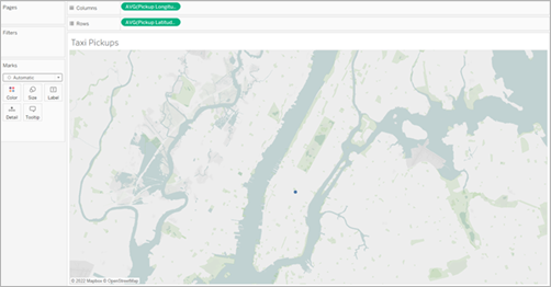
In the Data pane, select both Pickup Latitude and Pickup Longitude and drag them onto the canvas.
The Latitude and Longitude fields are added to the Columns and Rows shelves, and a map view with one data point is created.
-
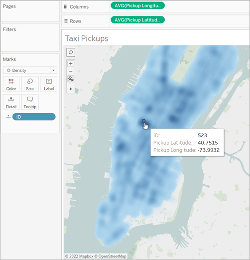
Next, add distinct marks to the view. Right-click (Control-click on Mac) ID and drag it onto Detail on the Marks card. Because each pickup has its own ID, this action breaks up the marks and distinguishes one pickup from another on our map.
There will be a warning letting you know that the field added may contain more than the recommended maximum of 1000. Select Add all members.
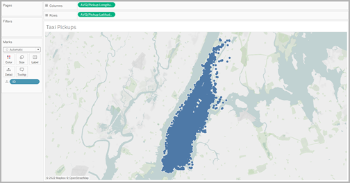
The map view updates to show marks for every pickup location in your data source. Since every location is within Manhattan, the map will zoom to focus on Manhattan in New York City.
Note: You might need to filter some data points from your view to create the level of zoom desired.
-
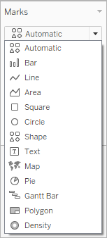
On the Marks card, change the mark type to density by selecting the drop-down menu to the right of Automatic and select Density.
-
Your basic density map is created.
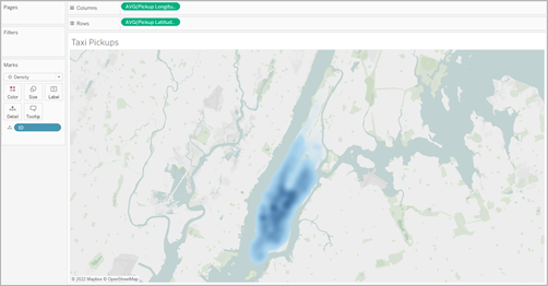
You can see that midtown is the most popular area for taxi pickups, and you can adjust the focus further by using the zoom tool. Density will recompute as you zoom in or out.You can select an individual data point from anywhere in your density map. These marks have size (10 pixels) and color (blue) applied by default. Size and color are not adjustable for underlying marks.
Zoom around the map to analyze your data. Selection, tooltips, labels, and hovering all work based on the marks in the zoom of the view. Density maps have no fixed or constant display and will always recompute as you zoom.
Adjust the appearance
You can adjust the color, intensity, and size of your marks to help you analyze the data on your density map.
Color: Adjust the colors of your density map by selecting Color from the Marks card. Choose from ten density color palettes or any of the existing color palettes. The density color palettes are tailored for working on either light or dark base maps.
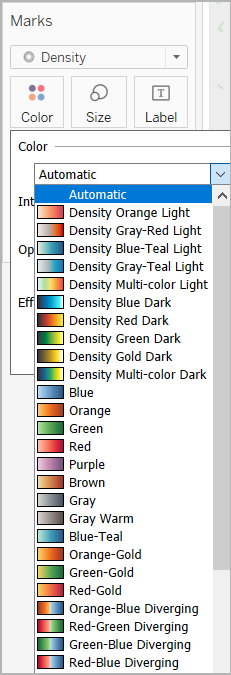
Note: If your data source contains negative values, those values will also appear when a measure field is added to Color. Use a diverging color palette to make a clear distinction between positive and negative values.
Intensity: In the Color menu, use the Intensity slider to increase or decrease the vividness of your map. For example, increasing density lowers the "max heat" spots in your data, so that more appear.
In the following image, the low intensity map is set at 50%, and the high intensity map is set at 75%.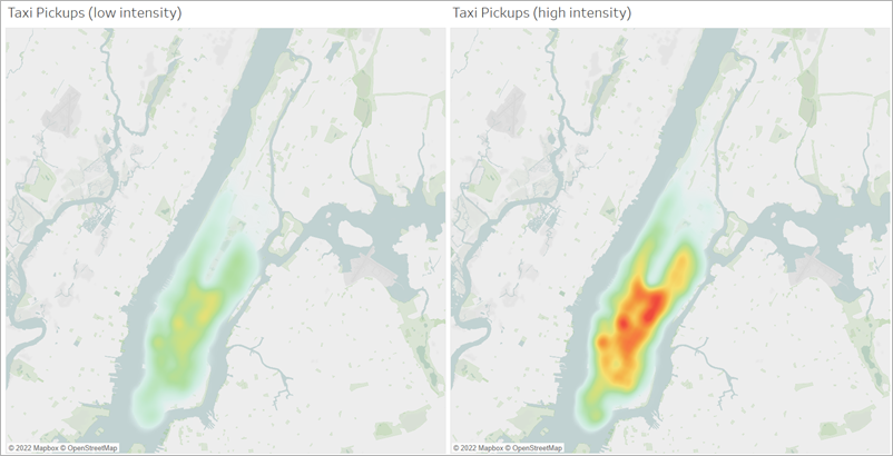
Size: You can use the Size shelf to adjust the size of the density marks. Click the Size to show the size slider. Adjust the slider to increase or decrease the size of the marks group that makes your density map.