Create Maps that Highlight Visual Clusters of Data in Tableau
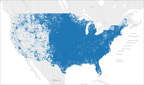
You can create maps in Tableau Desktop that help you spot visual clusters, similar to the example below. These types of maps are called point distribution maps.
Point distribution maps are great for showing the how locations of your data points are distributed.
This topic illustrates how to create a point distribution map using an example. Follow the example in this topic to learn how to set up your data source, and build the view for a point distribution map.
Your data source
To create a point distribution map, your data source should include the following types of information:
- Latitude and longitude coordinates for all of your locations
For example, the following table is a snippet of the Hail data source, which is included in the Create Point Distribution Maps in Tableau Example Workbook(Link opens in a new window) on Tableau Public. It contains columns for the latitude and longitude coordinates of hail storms across the United States from 1955 to the 2013.
| Latitude | Longitude |
| 32.2000 | -101.5000 |
| 38.5800 | -92.5800 |
| 41.2000 | -89.6800 |
| 39.2800 | -87.4000 |
| 41.7800 | -87.7800 |
| 39.5000 | -90.0800 |
Basic map building blocks
| Columns shelf: | Longitude (continuous dimension, longitude geographic role assigned) |
| Rows shelf: | Latitude (continuous dimension, latitude geographic role assigned) |
| Mark type: | Automatic |
Build the map view
To follow along with this example, download the Create Point Distribution Maps in Tableau Example Workbook(Link opens in a new window) from Tableau Public, and open it in Tableau Desktop.
-
Open a new worksheet.
-
Ensure that the Latitude geographic role is assigned to your latitude field, and the Longitude geographic role is assigned to your longitude field.
For more information, see Assign a geographic role to a field(Link opens in a new window).
-
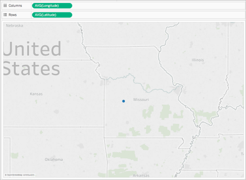
In the Data pane, double-click Latitude and Longitude to add them to the view.
The Latitude and Longitude fields are added to the Columns and Rows shelves, and a map view with one data point is created.
-
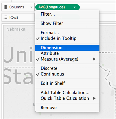
On the Columns shelf, right-click Longitude and select Dimension.
-
On the Rows shelf, right-click Latitude and select Dimension.
The map view updates with every location in your data source.
Note: You might need to filter some data points from the view.
-
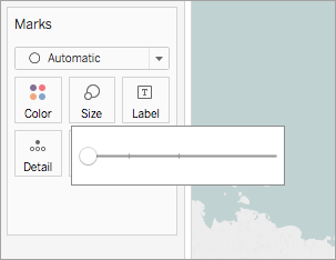
On the Marks card, click Size, and then move the slider to the left.
Your point distribution map is now complete. A data point for every location in your data source is now plotted on the map (minus any you filtered from the view). You can now see that a majority of hailstorms occur in the eastern half of the United States.

See also:
Mapping Concepts in Tableau(Link opens in a new window)
Create Maps that Show Quantitative Values in Tableau(Link opens in a new window)