Build a Simple Map
You can build several different types of maps for your geographic analysis in Tableau. If you're new to maps, or simply want to take advantage of the built in mapping capabilities that Tableau provides, you can create a simple point or filled (polygon) map similar to the examples below.
Prerequisites: To build a simple map, your data source must contain location data (for example, location names or latitude and longitude coordinates). If your data source doesn't contain location data, see the Map Data(Link opens in a new window) section for ways you can connect to location data.
|
|
This topic illustrates how to create a simple map using an example. To follow along with the example below, open Tableau Desktop and connect to the Sample-Superstore data source, which comes with Tableau.
Build a simple point map
-
Navigate to a worksheet.
-
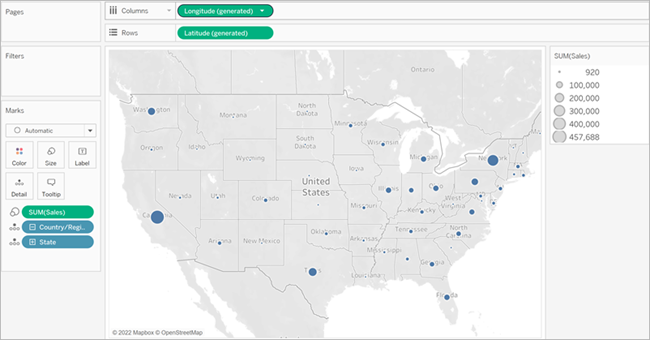
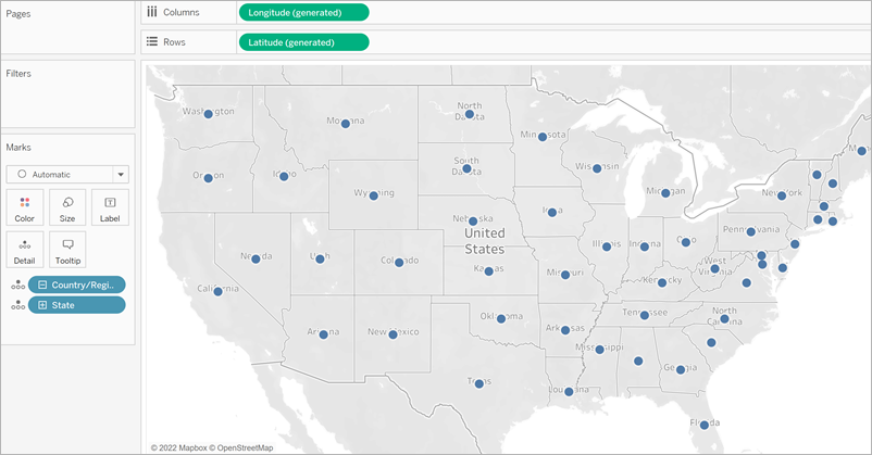
In the Data pane, open the Location folder and double-click State.
A map view is automatically created because the State field is a geographic field. To learn more about geographic fields and how to create them, see Assign a geographic role to a field.
-
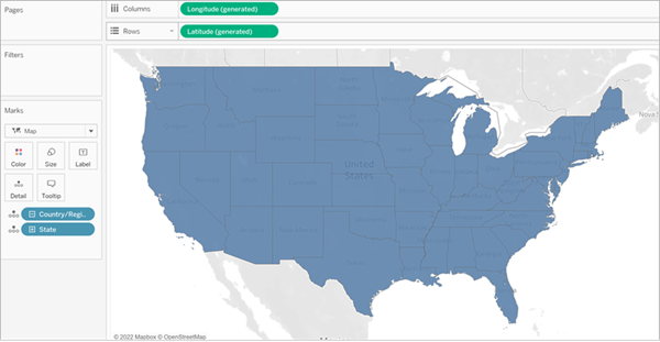
From the Orders table in the Data pane, drag Sales to Size on the Marks card.
The data points on the map update to show the amount of sales proportionally.

-
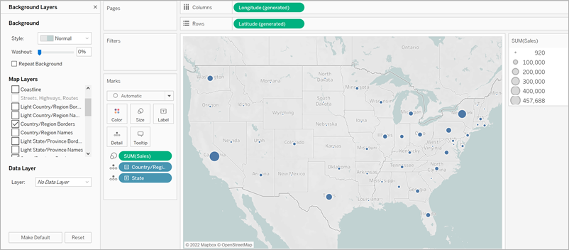
Select Maps > Background Layers.
-
In the Background pane, click the Style drop-down and select Normal.
- Under Background Map Layers, clear Country/Region Names. The background map updates with the new settings.
Build a simple filled (polygon) map
-
Navigate to a new worksheet.
-
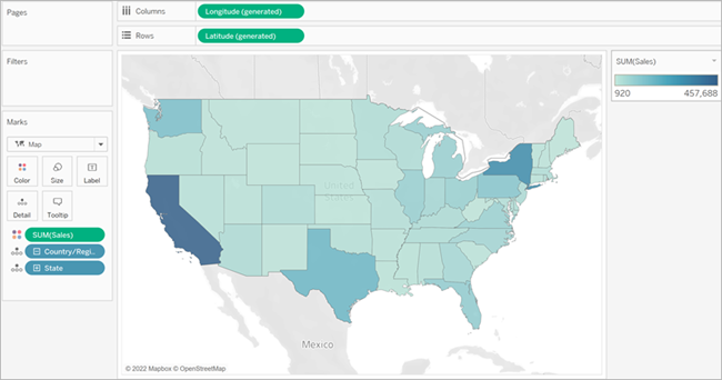
In the Data pane, open the Location folder and double-click State.
A map view is automatically created.
-
On the Marks card, click the Mark Type drop-down and select Map.
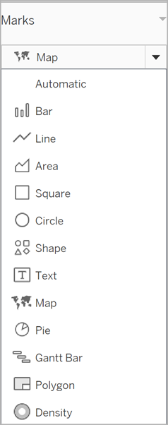
The map view updates to a filled (polygon) map.
-
From the Orders table in the Data pane, drag Sales to Color on the Marks card.
The polygons on the map update to show the amount of sales using color.
Build a heatmap (density map)
Heatmaps, also known as Density Maps, help you identify locations with greater or fewer numbers of data points. Heatmaps are most effective when working with a data set containing many data points where there is substantial overlap between the marks on the map.
To learn more about Heatmaps and find out how to create and customize them, see Create Heatmaps that Show Trends or Density in Tableau.
To follow along with this example, download the heatmap_taxi_howto example workbook. (Click Download in the upper right hand corner) and open it in Tableau Desktop.
- Navigate to a new worksheet.
- From the Data pane, drag both Pickup Latitude and Pickup Longitude onto the canvas.
A map view is automatically created.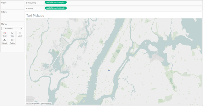
Note: Because Tableau is averaging the latitude and longitude of the data, there is only one mark on the canvas. This will update when you add a measure.
- Drag a measure field, such as ID, to Detail on the Marks card.
- On the Marks card, click the Mark Type drop-down and select Density.
The marks update on the map to show the concentration of taxi pickups per location. The
darker colors indicate locations with more pickups, and the lighter colors indicate locations with fewer pickups.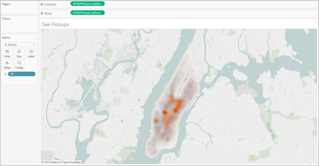
See also:
Mapping Concepts in Tableau(Link opens in a new window)