Example: Add a Parameter to a Map View
This example uses the World Indicators sample data source to demonstrate the following:
-
How to build a map view that shows the birth rate for each country in the world.
-
How to create a calculated field that distinguishes countries/regions with a low birth rate from those with a high birth rate.
-
How to create and display a parameter so that users can set the threshold for low vs. high birth rate.
Build a map view
-
In the Data pane, double-click Latitude and then Longitude.
Tableau puts Longitude on Columns, Latitude on Rows, and displays a map of the world.
-
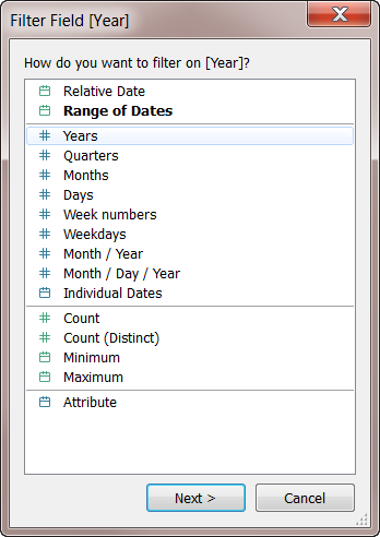
Drag the Year dimension to Filters.
-
In the Filter Field [Year] dialog box, choose Years and then click Next:
-
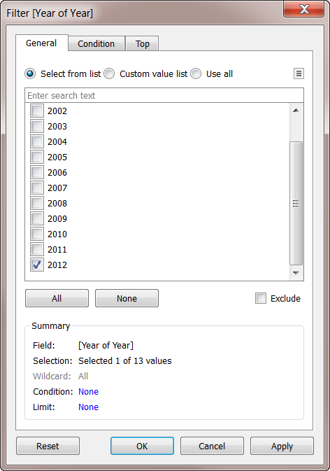
In the Filter [Year of Year] dialog box, select 2012 and then click OK:
-
Drag the Country dimension to Detail.
-
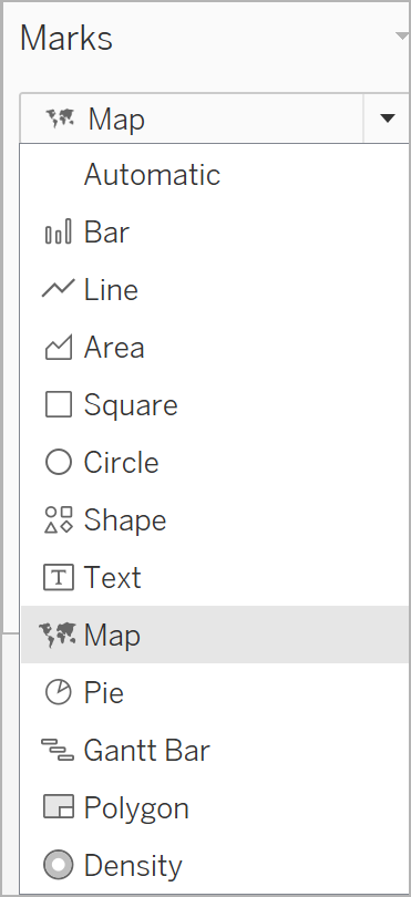
Set the Marks type to Map:
-
Drag the Birth Rate measure to Label.
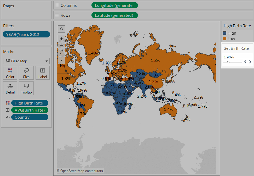
You now have a map that shows birth rates for countries/regions around the world:
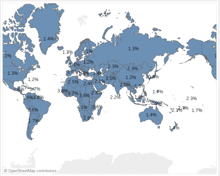
You can zoom the map or hover to see a tooltip for any country.
Create a calculated field to set a threshold
Next, you'll distinguish a low birth rate from a high birth rate.
-
From the top menu, select Analysis > Create Calculated Field .
-
Name the field
High Birth Rateand type or paste this calculation in the formula field:IF ([Birth Rate]) >= 0.014 THEN "High" ELSE "Low" ENDThe value 0.014 is equivalent to 1.4%. The range of actual values that we can see on the map range from below 1% up to nearly 5%.
When you click OK to apply and save this calculation, Tableau categorizes it as a dimension.
-
Drag High Birth Rate to Color.
The map now shows low birth rate countries/regions in one color and high birth rate countries/regions in another:
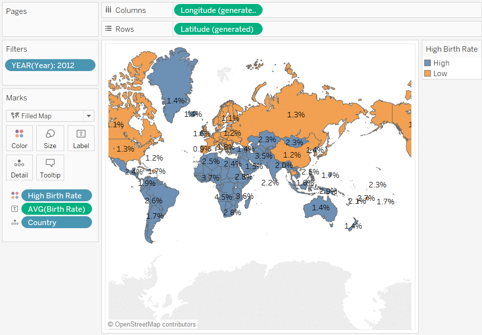
But the definition of high birth rate as anything equal to or greater than 1.4% is arbitrary—that value was chosen because it divided the world's countries/regions about evenly.
Instead, you can let users define that threshold, or give them a control that they can use to see how changing the threshold changes the map. To do this, you create a parameter.
Create a parameter
-
Right-click (control-click on a Mac) in the Data pane and select Create > Parameter.
Note: If you clicked on a field on the Data pane, some fields might be filled. You can just change the fields as needed.
-
In the Create Parameter dialog box, name the new parameter
Set Birth Rateand configure it as shown: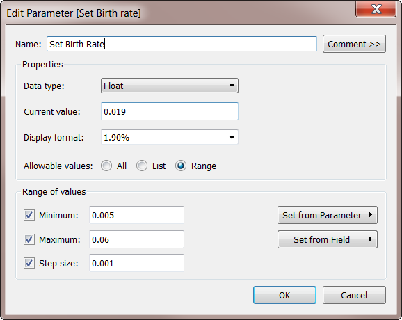
For information on the fields in the Create Parameter dialog box, see Create Parameters.
Because the Data Type is Float, the parameter control, when you display it in the next procedure, will be in the form of a slider. This is because floating point values are continuous—there are an infinite number of possible values.
The Current value sets the default for the parameter: 0.019 is 1.9%. The Range of values section sets the minimum and the maximum values and the step size—that is, the least amount by which the value can change.
-
Click OK .
Create and display the parameter control
Now you must connect the parameter to the High Birth Rate field.
-
Right-click High Birth Rate in the Data pane and select Edit.
-
Replace the hard-coded 0.014 value in the field definition with the parameter name:
IF ([Birth Rate]) >= [Set Birth Rate] THEN "High" ELSE "Low" ENDThen click OK.
-
Right-click the Set Birth Rate parameter in the Data pane and select Show Parameter Control.
By default, the parameter control is shown on the right. Now you and users of your view can raise or lower this value incrementally to see how changing the definition of "high birth rate" affects the map.