Choose the Right Chart Type for Your Data
What chart or graph works best for your data? In Tableau, form follows function. The visualization (or viz) you create depends on:
- The questions you are trying to ask
- The properties of your data
- How you want to present and communicate your insights to others
For example, showing the growth in sales each year requires a different visualization than showing the connection between discounted items and their profitability. Knowing what you need to show will help determine how you want to show it.
This topic presents nine different types of information that you can display with a visualization. This isn't a comprehensive list, and there are bound to be exceptions to these categories. With experience you will be able to more quickly assess what chart type you want to create. Because Tableau is flexible, we encourage you to think outside the box. However, before you think outside the box, it's helpful to start with some common chart types.
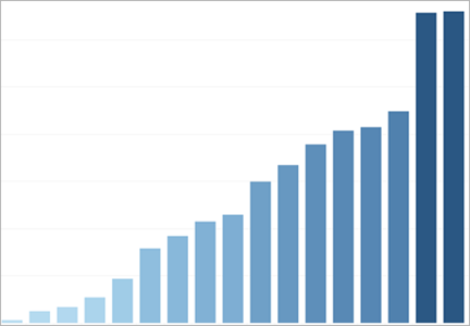
Change over time
Related topics
|
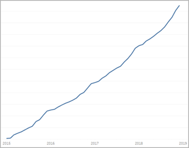
Showing a change over time for a measure is one of the fundamental categories of visualizations. There are many options for exploring change over time, including line charts, slope charts, and highlight tables. To show change over time, you need to know the value you expect to change, and how to work with Date fields in Tableau. What kind of question does this chart answer?
|
Correlation
Related topics
|
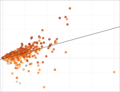
Sometimes you have two variables and are looking for the relationship between them. For example, you may be looking for the relationship between classroom size and school graduation rate, or how much lung capacity relates to endurance. (But remember, correlation does not always equal causation.) Correlation can be shown with scatter plots or highlight tables, and you can use Tableau's analytics objects(Link opens in a new window) to show the strength of the correlation. What types of question can this chart answer?
|
Magnitude
Related topics
|
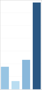
Magnitude shows the relative size or value of two or more discrete items. If you are comparing sales for different regions, you are looking at magnitude. Magnitude charts include bar charts, packed bubble charts, and line charts. What types of question can this chart answer?
|
Deviation
Related topics
|
Deviation charts show how far a value varies from some baseline, such as the average or median. If you wanted to know which items had unusually high or low profit margins, you would use a deviation chart. You can use bullet charts, bar charts, and combination charts to show deviation. You can also find the statistical significance of the deviation using a Z-score. What types of question can this chart answer?
|
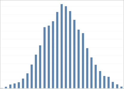
Distribution
Related topics
|
When you are trying to find the frequency of events within a population, you are looking at the distribution. If you are showing the number of respondents to a survey by age, or the frequency of incoming calls by day, a distribution chart might be the best choice. Distribution charts include histograms, population pyramids, Pareto charts, and box plots. What types of question can this chart answer?
|
Ranking
Related topics
|
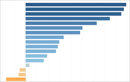
Sometimes you not only want to depict the magnitude of some value, but also the relative ranking of all the members of your dimension. Showing the top ten sales people or demonstrating the under-performing states use a ranking chart. Ranking charts are usually bar charts that integrate rank calculations, top n sets, or key progress indicators. What types of question can this chart answer?
|
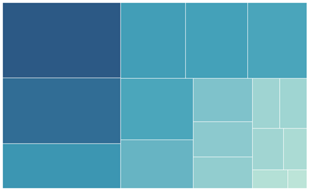
Part-to-Whole
Related topics
|
Part-to-Whole charts show how much of a whole an individual part takes up. For example, if you are showing how much each region contributes to overall sales, or how expensive each different shipping mode is for an individual product, you would use a part to whole chart. Part-to-Whole charts can be pie charts, area charts, stacked bar charts, or treemaps. What types of question can this chart answer?
|
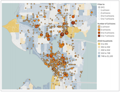
Spatial
Related topics
|
Spatial charts can precise locations and geographical patterns in your data. Showing the airport terminals with the most foot traffic or a map of all sales across the country are examples of spatial maps. Spatial maps include filled maps, point distribution maps, symbol maps, and density maps. What types of question can this chart answer?
|
Flow
Related topics
|
Flow charts can be maps that convey movement over time, such as Sankey diagrams. Flow maps include path over time and path between origin and destination charts. What types of question can this chart answer?
|

Related resources
For related content and examples of different types of visualizations you can create with Tableau, see:
- Build Common Chart Types in Data Views(Link opens in a new window) and Build Advanced Chart Types in Tableau help.
- Which Chart or Graph is Right for You?(Link opens in a new window) whitepaper on the Tableau website. Use your tableau.com account to sign in.
- Visual Vocabulary(Link opens in a new window) on Tableau Public by Tableau Visionary Andy Kriebel(Link opens in a new window) (also see Andy's blog(Link opens in a new window)).
Also see these free videos and presentations:
- Andy Cotgreave's Best of the Tableau Web(Link opens in a new window) and other blog posts on tableau.com.
- Secrets of Visual Analytics(Link opens in a new window) This four-part, on-demand webinar series introduces how to use Tableau for visual analytics. Use your tableau.com account to sign in.
- Travel Tips for Your Visual Analysis Journey(Link opens in a new window) (50 minutes) video presentation from Tableau Conference.