Author Views for Accessibility
This article provides more detail on the design guidelines discussed in Best Practices for Designing Accessible Views, and steps on how to create these views in Tableau Desktop (version 10.2 and later).
As a content author, you can create views that help you align with Web Content Accessibility Guidelines (WCAG) following these general steps:
Step 1: Author views following accessibility best practices.
Step 2: Publish the views to Tableau Server or Tableau Cloud (version 10.2 and later).
Step 3: Share the link for users to access the content in Tableau Cloud or Tableau Server, or embed the views in a web page for users to access the content.
Creating views using best practices guidelines can make them more accessible; they’re treated by screen readers as images with a title and a description. Users will be able to use keyboard navigation to open the View Data pane and access the underlying data for the view.
Many of the principles that apply to creating effective views in Tableau also apply to creating accessible views. The main difference in creating accessible views is that you should always provide other types of mark encoding when you use color in the view. You also want to use text more liberally in the view to provide context for the view and its marks.
When creating accessible views, keep it simple. Simplicity helps people more easily see the relationships and intersections in your data.
How can you make a view more simple? Emphasize only the most relevant and important data. Reduce the marks in the view to only show what is needed. Limit the level of detail and granularity in the view to prevent cognitive overload.
When you design your views, keep in mind that your users will be accessing the underlying data in the view. The data you include in the view is what screen readers read when users access the underlying data in the Summary tab of the View Data pane.
Guidelines that support simplicity:
- Limit the number of marks in the view
- Orient your views for legibility
- Limit the number of colors and shapes in a single view
- Use filters to reduce the number of marks in the view at a given time
Limit the number of marks in the view
Keep the number of marks below 1,000 to ensure the view will be rendered in the browser and not on the server.
Note: Client-rendered views can be more accessible than server-rendered views. To ensure an embedded view is rendered in the browser, make sure the view has fewer than 1,000 marks, including items in legends and filters.
You can see the number of marks a view has when you're authoring the view in Tableau Desktop (bottom-left corner of the window).
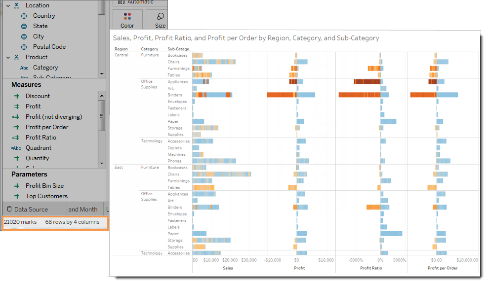
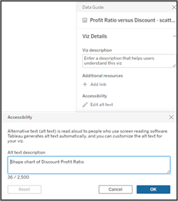
Example of a view with too many marks
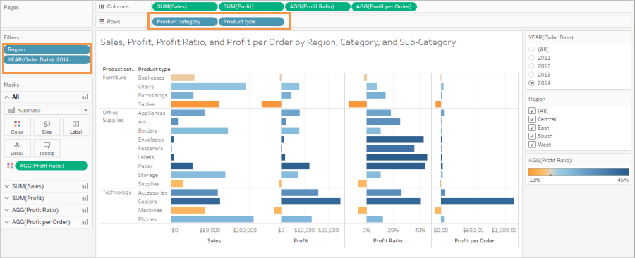
The following example shows a view with over 20,000 marks. The view shows a more granular level of detail in the data (versus aggregated). Multiple dimensions (Region, Category, Sub-Category) and measures (Sales, Profit, Profit per Order, and Profit Ratio) have been added to the view. Product Name is on Detail, which adds a mark for every product included in the data set.
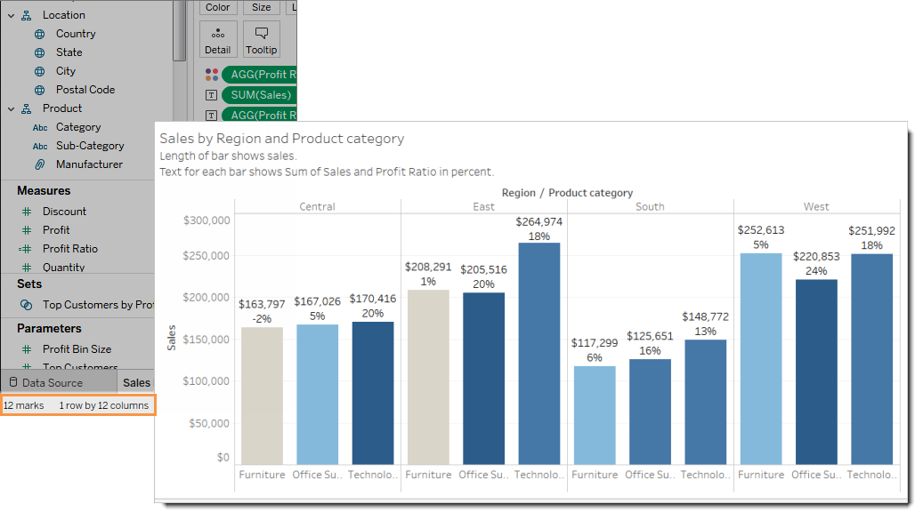
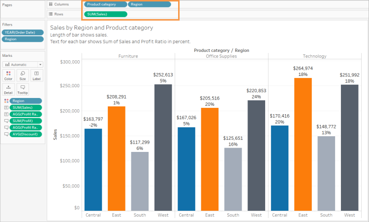
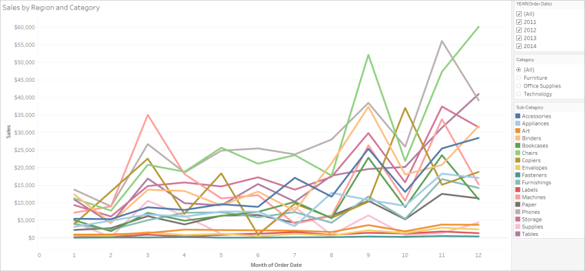
Example of a view with fewer marks
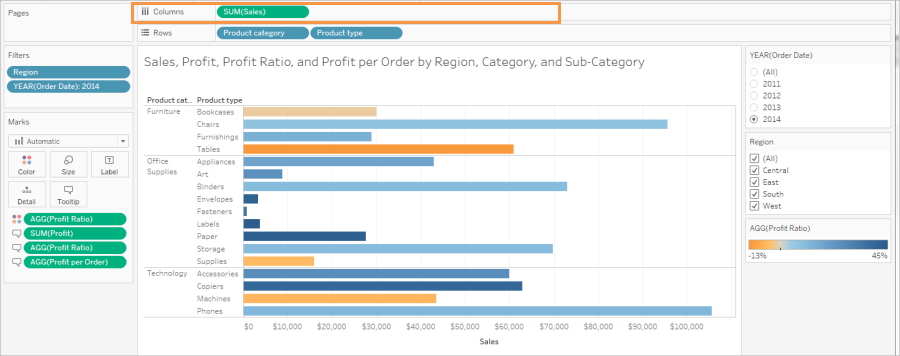
The next example shows a more accessible view (fewer than 100 marks). The data is aggregated and shows a less granular level of detail in the data. Two dimensions (Region and Product Category) and one measure (Sales) are used in the view.
For more details about these concepts, see Data Aggregation in Tableau and How dimensions affect the level of detail in the view.
There are several ways you can limit the number of marks:
Create views of aggregated data rather than showing more granular levels of detail in the view. Don't place dimensions that contain thousands of values on Detail in the Marks card.
If you want to use a dimension that is in a hierarchy, but not make the hierarchy available in the view, use a copy of that particular dimension. Copy the field you want to use from the hierarchy and build the view with the copied version of the dimension.
Doing this prevents users from expanding the hierarchy in the embedded view, which might increase the number of marks in the view and result in the view being rendered on the server instead of the browser.
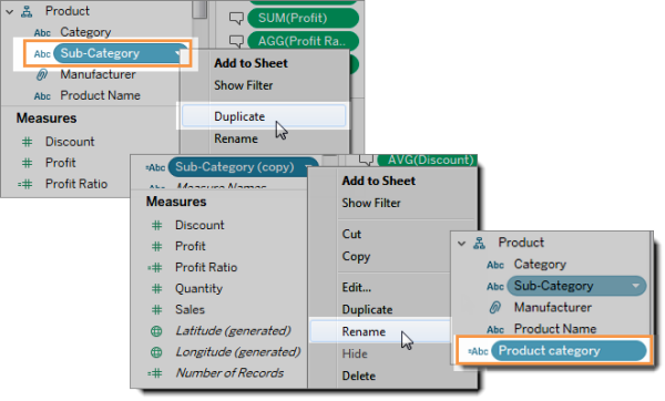
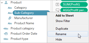
Right-click a dimension in the hierarchy, and then select Duplicate. A copy of the dimension appears.
Right-click the copied dimension, and then select Rename. Give the copied dimension a unique, meaningful name. Now use that dimension to build the view.
Limit the number of measures and dimensions used to create the view.
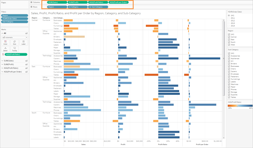
Less accessible: The next example shows a view with four measures on Rows and three dimensions on Columns. More fields create a more complex view.
More accessible: This view has two dimensions on Columns and one measure on Rows. Fewer fields in the view structure reduces cognitive overload.
Orient your views for legibility
Horizontally oriented labels and headers are easier to read than vertically oriented labels.
Less accessible: In this example, the text is being displayed vertically.
More accessible: In this example, space has been added to the view to allow the text to be displayed horizontally.
To change the orientation of the view and its headers and labels, you can click the Swap button on the toolbar, or you can resize the view to allow more room for horizontal labels. In this example, the table was resized. For details, see Resize Tables and Cells.
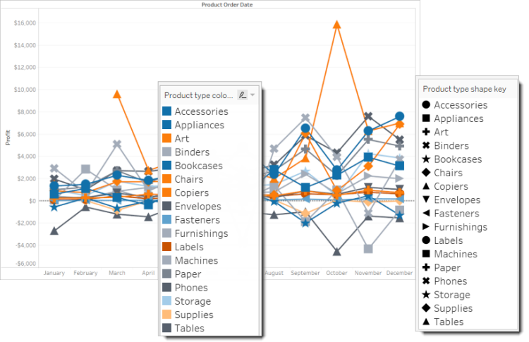
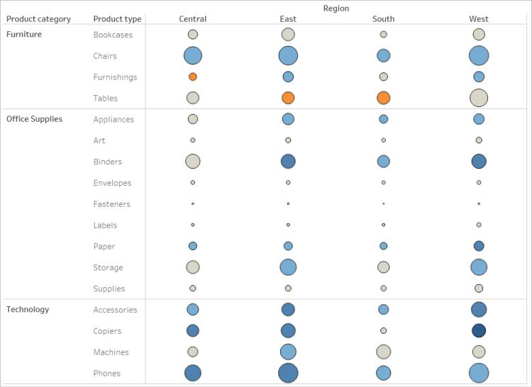
Limit the number of colors and shapes in a view
If you're showing a dimension on Color or Shape, don't use more than 10 colors and shapes in one view so that users can distinguish each color and shape and see important patterns.
Don't do this: In the following example, the line colors have started repeating after the 10th mark applied to Product type.
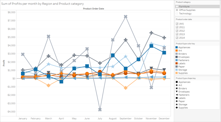
Do this: In the next example, filters have been used to limit the number of marks that can be shown at a time. As a result, the number of colors and shapes in the view is never more than ten.
Use filters to reduce the number of marks in a view
Using filters helps to focus the number of marks in the view to only what you want users to see. For more details about creating filters, see Filter Data from Your Views.
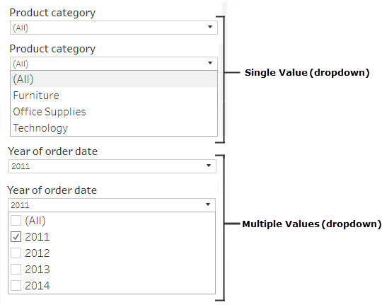
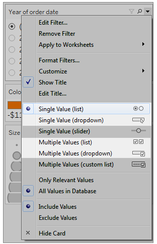
You can also show the following filter modes to allow users to control what data is in the view. The filter modes that support more accessible views in Tableau are:
Single Value (list): a filter with radio buttons. Only one item can be selected at a time. Giving your users single-value filters is a great way to reduce the number of marks in the view.
Multiple Values (list): a filter with a list of items (with check boxes) that can be selected at the same time. Multiple-value filters will allow more marks to be shown at the same time.
Single Value (dropdown): a filter with a dropdown list of items. Only one item can be selected at a time. Giving your users single-value filters is a great way to reduce the number of marks in the view.
Multiple Values (dropdown): a filter with a dropdown list of items that can be selected at the same time. Multiple-value filters allow more marks to be shown at the same time.
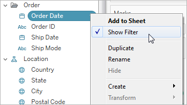
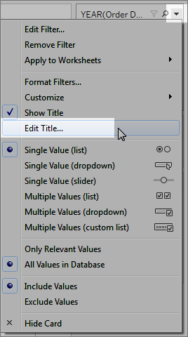
To show a filter, right-click the field you want to use as a filter, and then select Show Filter.
To select the filter mode, in the drop-down menu for a filter, select a Single Value (list), Single Value (dropdown), Multiple Values (list), or Multiple Values (dropdown) filter.
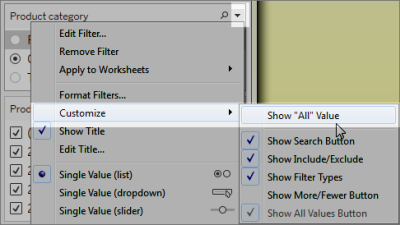
For a Single Value (list) or Single Value (dropdown filter), you can remove the All option from the filter. In the drop-down menu for the filter, select Customize and then clear the Show "All" Value option.
The following image shows the Customize option in a filter.
When you're using multiple filters in a worksheet, keep the following guidance in mind:
When you're creating a view, test the browser zoom up to 200% to make sure all of the components in the view display as intended.
Avoid positioning filters horizontally in a worksheet. In instances where the browser window isn't wide enough, components in the view (such as filters) will overlap with the visualization.
Don't reposition the filters after you add them to the view. If you reposition the filters or change their order, the tab order may change.
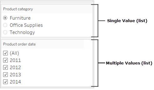
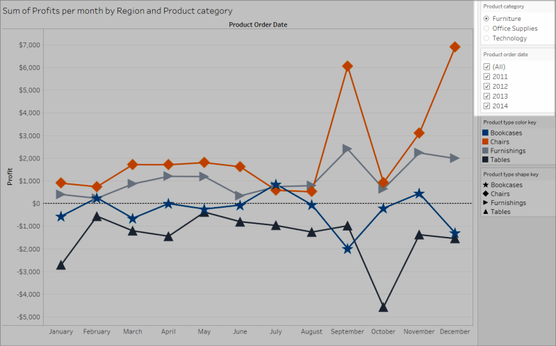
This example shows a view with a Single Value (list) filter for the Product category and a Multiple Values (list) filter for Product order date. The Single Value (list) filter only allows one product type to be shown at a time (All is hidden).
In your views, make sure you show titles, captions, and mark labels. You can edit titles and captions to provide more context and details that help users understand the view.
Be precise and consistent in how you name every object in the view.
Provide text that explains how components of a visualization relate.
Simplify text to remove redundancies.
You can also rename measures and dimensions in the Data pane to make sure field names in the view are meaningful.
Here are the different elements in a view that you can show and edit:
Titles (worksheet, filters, and legends). Show titles for the worksheet, filters, and legends. The default title text is the sheet name or field name referenced by the filter or legend. You can edit any title to provide more context.
Captions (in worksheets). Show the caption in the worksheet. The default caption text gives a summary of what is shown the view. You can add to this text to provide more context.
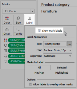
Labels (Marks card, Label button). By default, labels aren't shown in a view, so you must select the option to show them.
Less accessible: This example shows a view with limited text. Many text elements aren't shown: the worksheet caption, mark labels, a descriptive title, and additional text about the view in the Title area. Also, the filter and legend titles haven't been edited to provide more context.
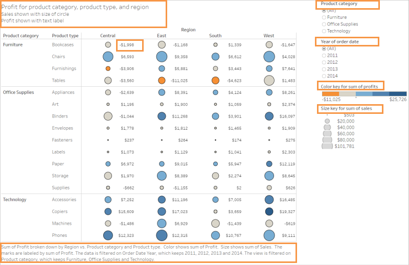
More accessible: This example shows the same view with multiple text elements shown to provide more detail and context. Titles and captions are shown in the worksheet. The worksheet title was edited to include text that describes how data is indicated in the view. The worksheet caption includes the default summary text that is automatically generated by Tableau. The legend titles have been edited to make more sense in this view. Mark labels show Profit values so that users don't have to rely only on seeing the color.
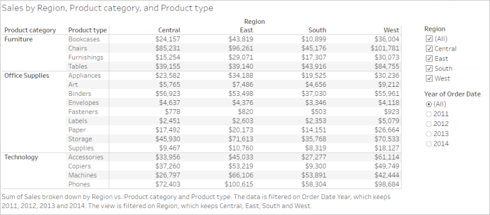
You also can build views that show only text, such as this example of a Text Table view that shows similar data.
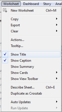
To show and edit titles and captions for the worksheet
Select Worksheet > Show Title, and then select Worksheet > Show Caption.
In the Title box at the top of the view, click the drop-down menu, and then click Edit title.
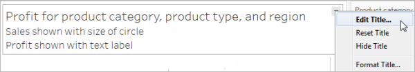
Type text in the text area and format it, and then click OK. You can add text in addition to markup text, or replace the markup text.
In the Caption box, click the drop-down menu, and then click Edit caption.
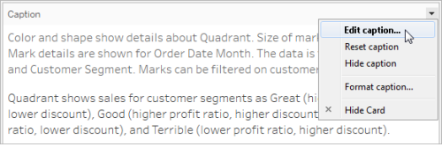
Type text in the text area and format the text, click the drop-down menu, and then click OK. You can add text in addition to the default text, or replace the default text.
To show mark labels in the view
Click Label in the Marks card, and then click Show mark labels.
To edit field names in the Data pane
Right-click the dimension or measure, and then click Rename.
Edit the name, and the press Enter.
For more details, see Rename fields.
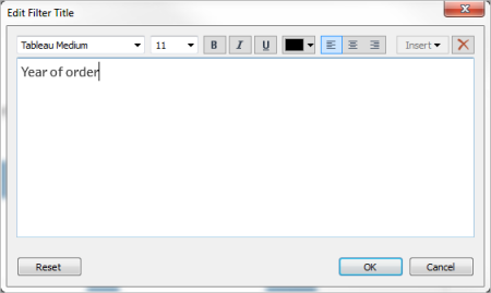
To edit filter or legend titles
The text associated with legends and filters should clearly describe their purpose. Edit titles for filters and legends to indicate function. Refer to filters by name in any instructions that you provide in the worksheet title or caption.
Click the drop-down menu for the filter, and then click Edit Title.
Edit the text, and then select OK.
Font Size
Increasing the font size of your text can make it more accessible. Select Format > Workbook to change the default text sizes for the entire workbook. For more details, see Format Your Work.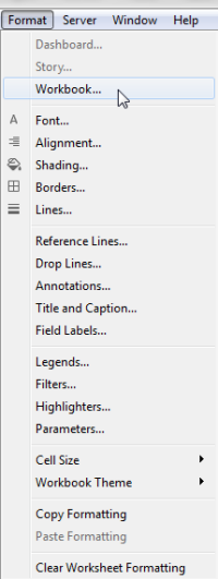
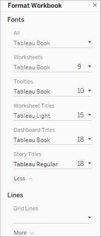
You can also change the font size at the worksheet level.
Starting in Tableau Cloud 23.2 and Tableau Desktop 23.3, you can customize the alt text auto-generated by Tableau, which can help make it more descriptive and meaningful to your audience.
In a dashboard, you can access the alt text editor through the context menu.
- Tap the viz to select it, expand the More Options menu, and choose Accessibility.
- Update the alt text in the alt text description box, and then select OK.
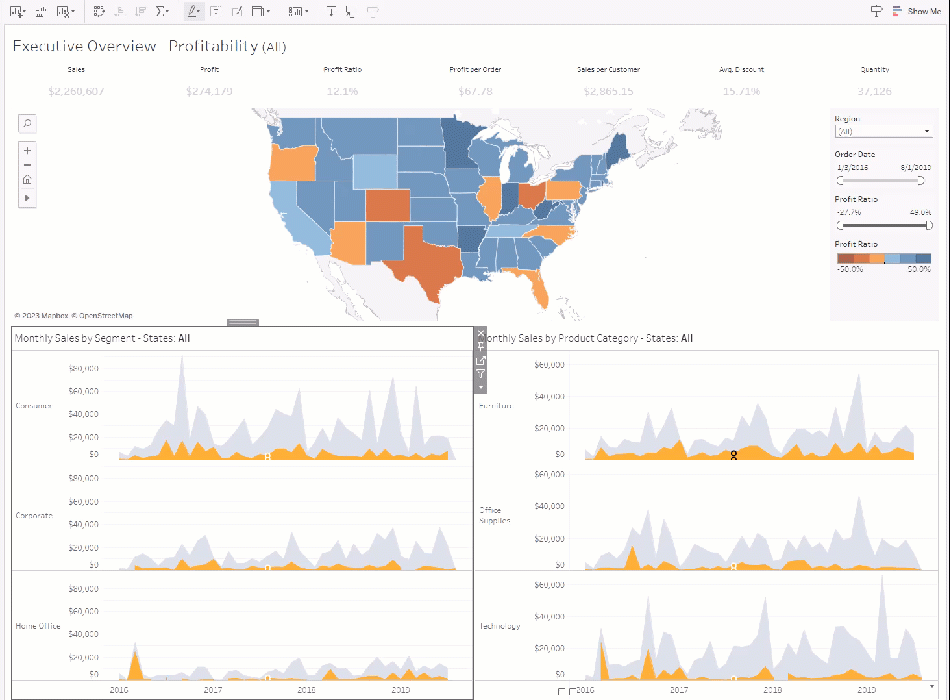
In a worksheet, you can access the alt text editor through the toolbar or the Data Guide pane.
From the toolbar:
- Select Worksheet and choose Accessibility.
- Update the alt text in the alt text description box, and then select OK.
From the Data Guide pane:
- In authoring mode, open the Data Guide pane by clicking the Data Guide
 icon.
icon. - Under Accessibility, select Edit alt text.
- Update the alt text in the alt text description box, and then select OK.
Note: You must be in authoring mode to edit alt text. If you don't have access to the Data Guide, check with your administrator. They may have hidden the Data Guide for your organization.
Use color thoughtfully and provide contrast
Different color palettes are available depending on the type of field being placed on Color in the Marks card. For any color palette that you use, make sure that you’re providing enough contrast and assign colors that differ from each other on the light-dark spectrum.
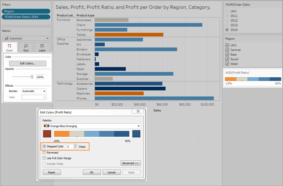
For dimensions (discrete), a suggested practice is to use the Color Blind palette. You may need to adjust the colors assigned to different dimension values. Try to provide enough contrast and assign colors that differ from each other on the light-dark spectrum. For monochromacy, try using the Seattle Grays palette with Stepped Color set to 5.
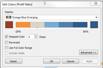
For measures (continuous), try using the Blue or Orange-Blue Diverging palette with the Stepped Color option set to 5. You may need to adjust the number of steps used. For monochromacy, consider using the Gray palette with Stepped Color set to 5.
For text color, general guidelines are that the visual presentation of text and images of text has a contrast ratio of at least 4.5:1 (large text 3:1). Tableau's default color formatting follows these prescribed contrast ratios. You can use a contrast analyzer(Link opens in a new window) tool to test the contrast ratios of text colors and backgrounds.
Important: When you use color in the view, you must also provide other types of encoding for marks, such as labels, size, shape, and position. Don't rely on color alone to communicate differences in marks.
Dimension on Color
Less accessible: This view shows an example of a discrete dimension being placed on Color, which is set to the Tableau 20 palette. The line path provides helpful position information, but the colors don't provide a clear distinction between the line marks.
More accessible: In the next example, the Color Blind palette is being used. Shape is also being used to reinforce what is being shown in color.
Measure on Color
Less accessible: This view shows an example of a continuous measure placed on Color, which is set to the Blue-Teal palette with gradient colors. The view doesn't provide enough contrast between colors and there's insufficient contrast on the light-dark spectrum. The use of size helps this view, but this color palette can make it hard for people with color vision deficiencies to see contrast differences between marks.
More accessible: This view uses the Orange-Blue Diverging palette with stepped colors. This palette provides improved contrast between marks.
To select a palette
You must already have a measure or dimension on Color in the view for this option to be available.
Click Color in the Marks card, and then click Edit Colors.
For Select Color Palette, click the drop-down arrow and select the palette.
This example shows selecting the Color Blind palette.
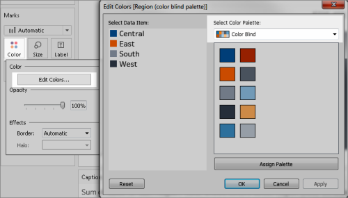
For the Color Blind palette, click Assign Palette, and then click OK. Otherwise, click OK.
To change the color of a value:
Click a value on the left, under Select Data Item.
Click a new color in the palette on the right. Hover over a swatch to identify the color. Repeat for many values that you want to change.
Click OK to exit the Edit Colors dialog box.
The following example shows the Orange-Blue Diverging palette with Stepped Color set to 5 steps.
For the Color Blind palette, click Assign Palette, and then click OK. Otherwise, click OK.
For details about colors and palettes, see Color Properties.
When you use color for field values, you must also provide other types of encoding for marks, such as labels, and position, size, and shape. Use position, size, or shape for the same field values to reinforce the differences between marks. These mechanisms all communicate information about the data to your users.
If you're using color to show measure or dimension values, make sure that you provide enough light-dark spectrum contrast for the colors that you assign to different marks.
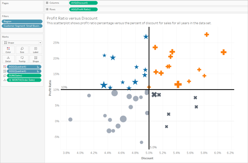
Less accessible: This example shows the same scatter plot with no use of color, shape, or size to create contrast. The position of the marks provides meaningful information, but the view could make use of more visual cues.
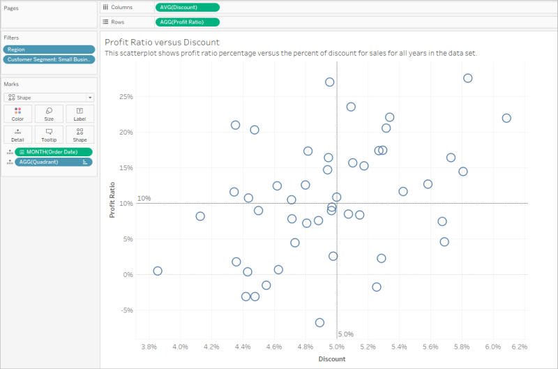
More accessible: This example shows a calculated field named Quadrant being used on color and shape. Position, color, and shape are used to distinguish each mark. The axes also clarify the mark position and meaning.
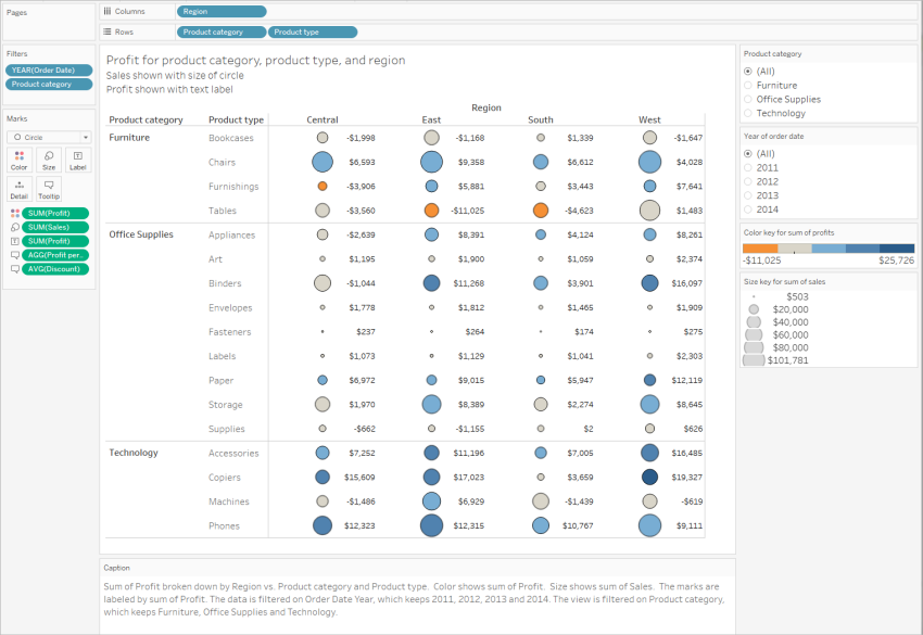
Putting it all together
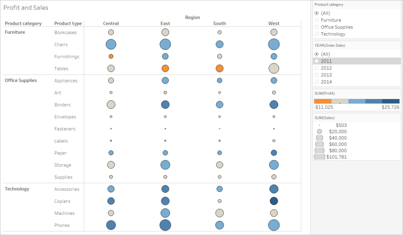
This next example shows how text, shape, color, and size can all work together to create an accessible view. Sales are represented by the size of each circle (mark). Profit represented by color and text. The title and caption for the view are shown and have been edited to provide more context. The filter and legend titles have also been edited to provide more context.
Let's convert a viz that isn't very accessible into one that is. The data in this starting view has a more granular level of detail and a structure that could contribute to cognitive overload with a screen reader.
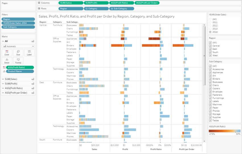
This view is designed to show total sales for each sales region, along with the profit ratio, to determine which types of products seem to be selling well but aren't actually profitable. Profit and Profit per Order are also shown.
We'll make changes to it based on the concepts and best practices mentioned previously in this article.
Step 1: Reduce the level of detail in the view.
Because the Product Name dimension is on Detail, every product in the data set is being represented with a mark in the view.
- Remove Product Name from Detail. This change reduces the number of marks in the view from over 20,000 to 272.
Reducing the number of marks in the view helps to ensure the embedded view will be rendered on the browser instead of the server.
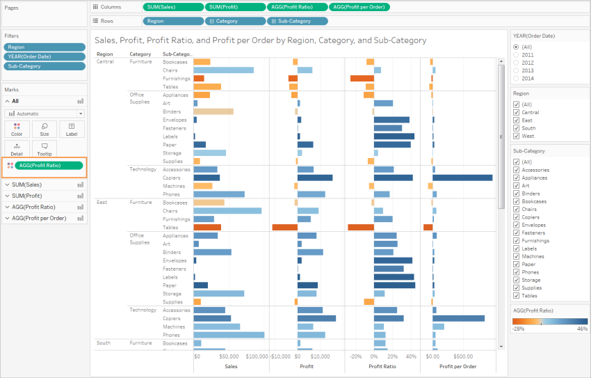
Step 2: Create a more aggregated view of the data.
Reduce the number of measures on Columns and the number of dimensions on Rows.
Remove Region (we can use a filter for Region). The number of marks changes to 68.
Replace Category and Sub-Category (both dimensions that are part of the Product hierarchy) with copies (not part of a hierarchy) that have been renamed Product category and Product type. Remove the Sub-Category filter.
Doing this prevents users from expanding the hierarchy in the embedded view, which might increase the number of marks in the view and result in the view being rendered on the browser instead of the server.
The view is already more aggregated and simplified, but we'll keep going.
- Move the Profit, Profit per Order, and Profit Ratio from the Columns shelf to Tooltip.
The number of marks is now 17. The underlying details in the data will still be available in the View Data window, but the reduced number of marks ensures the view will be more accessible because it will be rendered in the browser.
Step 3: Check the color palette settings.
The palette is set to Orange-Blue Diverging.
- Set Stepped Color to 5.
Step 4: Update and show text in the view.
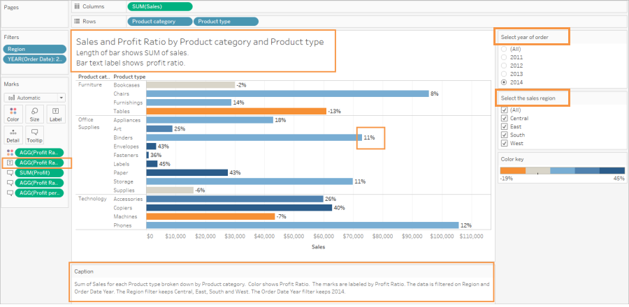
Change the Title to make sense with the new view.
Show the worksheet Caption.
Show Mark labels.
Drag Profit Ratio to Label in the Marks card.
Edit the filter and legend titles.
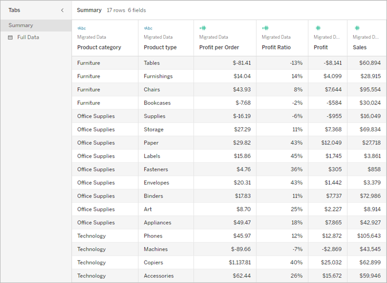
Step 5: Open the View Data window to the Summary tab.
This is the text that screen readers will read for this view. The four measures are included in the underlying data for each product type.
After you create your views, to make them more accessible, you can:
Publish views to Tableau Server or Tableau Cloud and share the link, or embed the view in an accessible web page. For information about how to publish a view, see Comprehensive Steps to Publish a Workbook.
Make sure users have permissions to access to the views and are able to view the underlying data in the View Data window.
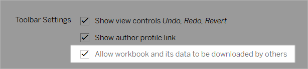
Publishing to Tableau Public
After creating your workbook and saving to Tableau Public, the "Allow workbook and its data to be downloaded by others" option must be enabled in order for the end user to be able to open the View Data window.
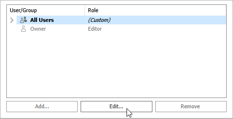
Turn off Web Edit permissions
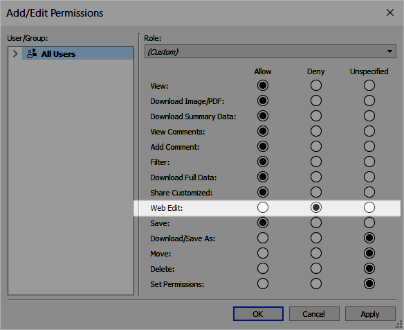
To prevent your users from seeing the Edit option in the view toolbar, set the Web Edit permission to Deny when you publish your workbook. You should also let your Tableau Cloud administrator know when you publish workbooks that should not allow users to access web editing mode.
In Desktop, select Server > Publish Workbook.
Under Permissions, select Edit, select All Users, and then select Edit again.
For the Web Edit permissions, select Deny. Click Apply, then click Ok.
Share or embed the view
When you're ready to share, go to the view in Tableau Server or Tableau Cloud and click the Share button in the view toolbar to copy the link or share with a user on the site. The view toolbar and navigation panel are supported for conformance, and include a "Skip to Content" option for keyboard navigation as well as a focus indicator.
Alternately, views can be embedded in the HTML code of a WCAG-conformant web page. For more information about how to embed views, see Embed Views into Webpages.
Sample embed code
<script type='text/javascript' src='http://Your_Server/javascripts/api/viz_v1.js'></script>
<div class='tableauPlaceholder' style='width: 1256px; height: 818px;'>
  <object class='tableauViz' width='1256' height='818' style='display:none;'>
    <param name='host_url' value='http%3A%2F%2FYour_Server%2F' />
    <param name='site_root' value='' />
    <param name='name' value='name of the visualization' />
    <param name='tabs' value='yes' />
    <param name='showShareOptions' value='true' />
  </object>
</div>
In a view URL:
https://myserver/t/Sales/views/MyCoSales/SalesScoreCard?embed=y
Embedded views must be rendered on the browser (not the server)
Server-rendered views are less accessible than client-rendered views. To ensure an embedded view is rendered in the browser, make sure the view has fewer than 1,000 marks, or set render to true in the URL for the embedded view.
For example:
http://localhost/views/Supplies/MyView?:render=true
Client-side rendering is enabled (true) by default.
About permissions
Users who need access to the underlying data will need the proper site role and permissions to view and interact with your embedded views. This includes having access to the projects and workbooks that contain the views. At the minimum, your users need View and Download Summary Data permissions. The ability to view the underlying data is necessary for users who use screen readers.
Users viewing the embedded view should have:
Site role of Explorer, Viewer, or Guest.
Note: The Viewer site role is more limited and won't be able to use filters or view the Full Data tab.
View permission for the project that the workbook is in.
View permissions for the workbook and its views.
Download Summary Data permission to read the underlying data in the view on the Summary tab of the View Data window.
Download Full Data permission if the user needs to be able to read all of the available data in the data source on the Full Data tab of the View Data window.
For information about how to set permissions for workbooks and views, see Set Content Permissions in the Tableau Cloud help.
Test the view
Test your embedded view using keyboard shortcuts for embedded views. Provide your users with this information in your user documentation.