Best Practices for Effective Dashboards
A well-designed dashboard can align your organization's efforts, help uncover key insights, and speed up decision-making. Use this topic for tips on best practices for creating effective dashboards in Tableau.
The best visualizations have a clear purpose and work for their intended audience. What will you be trying to say with this dashboard? Are you presenting a conclusion or a key question?
In addition to knowing what you're trying to say, it's important to know who you're saying it to. Does your audience know this subject matter extremely well or will it be new to them? What kind of cues will they need? Thinking about these questions before you head into the design phase can help you create a successful dashboard.
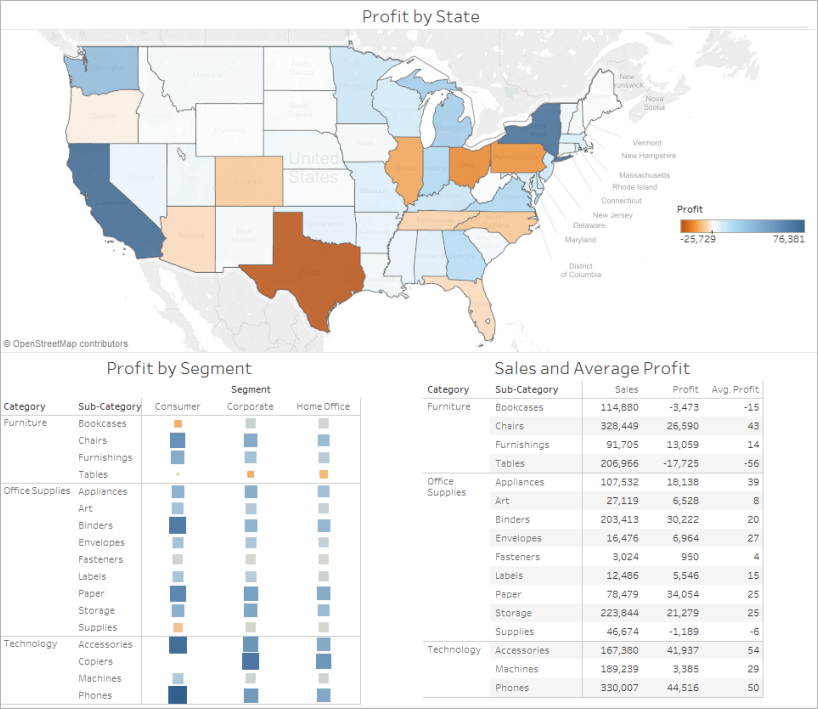
Most viewers scan web content starting at the top left of a web page. Once you know your dashboard's main purpose, be sure to place your most important view so that it occupies or spans the upper-left corner of your dashboard. In the dashboard below, the author decided that the map view holds the key message.
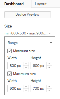
By default, Tableau dashboards are set to use a fixed size and if you keep this setting, be sure to construct your visualization at the size it will be viewed at. You can also set Size to Automatic, which makes Tableau automatically adapt the overall dimensions of a visualization based on screen size. This means that if you design a dashboard at 1300 x 700 pixels, Tableau will resize it for smaller displays—and sometimes this results in scrunched views or scrollbars. The Range sizing feature is helpful for avoiding this.
If you're using Tableau Desktop to create dashboards, you can also design for specific device layouts, so that on tablets, for example, your dashboard contains one set of views and objects, and on phones it displays another. See Create Dashboard Layouts for Different Device Types for steps.
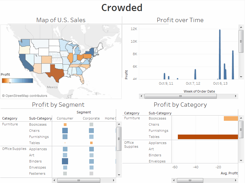
In general, it's a good idea to limit the number of views you include in your dashboard to two or three. If you add too many views, visual clarity and the big picture can get lost in the details. If you find that the scope of your story needs to grow beyond two or three views, you can always create more dashboards.
Too many views can also interfere with the performance of your dashboard after it's published.
Click the image to replay it.
Filters help users specify which data is shown in the view.
To turn on filters for a field:
In Tableau Desktop—Right-click the field in the Data window and select Show Filter.
In Tableau Server or Tableau Cloud—In the toolbar click Show/Hide Cards > Filters.
You can customize each filter for different types of data. For example, you can show filters as multi-select check boxes, single select radio buttons, or drop-down lists, etc. You can include a search button, the option to show all fields, null controls, and more. You can also edit the title of a filter to give your viewers clear instructions for interacting with the data.

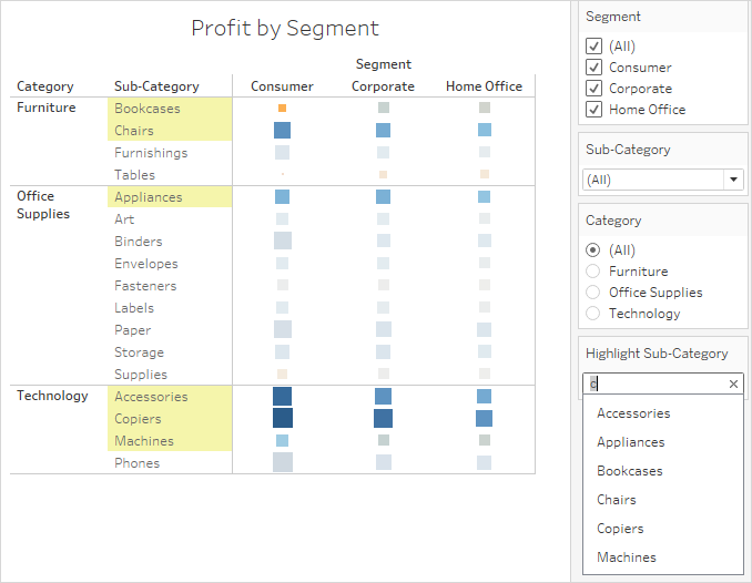
You can use the Highlight button on the toolbar to set up highlighting between views. When highlighting is turned on, a selection in one view will highlight related data in the other views. You can turn on highlighting for all fields or select specific fields. For more information about the different methods you can use to highlight data, see Highlight Actions(Link opens in a new window).
You can also display a highlighter that allows your customers to highlight parts of a view based on what they enter or select.
To display a highlighter:
Go to the worksheet where the view is (or select Go to Sheet from the dashboard).
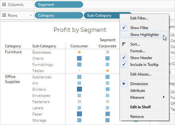
Right-click the field you want to highlight—it must be a discrete field—and choose Show Highlighter:
In the highlighter, your users will be able to select or enter terms to highlight data in the view: