Create a Forecast
To create a forecast, your view must be using at least one date dimension and one measure.
To turn forecasting on, right-click (control-click on Mac) on the visualization and choose Forecast >Show Forecast, or choose Analysis >Forecast >Show Forecast.
Each of the following examples indicate the structure that supports creating a forecast.
The field you want to forecast is on the Rows shelf and a continuous date field is on the Columns shelf.
The field you want to forecast is on the Columns shelf and a continuous date field is on the Rows shelf.
The field you want to forecast on either the Rows or Columns shelf, and discrete dates are on either the Rows or Columns shelf. At least one of the included date levels must be Year.
The field you want to forecast is on the Marks card, and a continuous date or discrete date set is on Rows, Columns or Marks.
Note: You can also create a forecast when no date dimension is present if there is a dimension in the view that has integer values. See Forecasting When No Date is in the View.
With forecasting on, Tableau visualizes estimated future values of the measure, in additional to actual historical values. The estimated values are shown by default in a lighter shade of the color used for the historical data:

Prediction Intervals
The shaded area in the image above shows the 95% prediction interval for the forecast. That is, the model has determined that there is a 95% likelihood that the value of sales will be within the shaded area for the forecast period. You can configure the confidence level percentile for the prediction bands, and whether prediction bands are included in the forecast, using the Show prediction intervals setting in the Forecast Options dialog box:
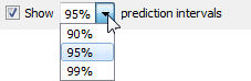
Clear the check box if you do not want to display prediction bands in forecasts. To set the prediction interval, select one of the values or enter a custom value. The lower the percentile you set for the confidence level, the narrower the prediction bands will be.
How your prediction intervals are displayed depends on the mark type of your forecasted marks:
| Forecast mark type | Prediction intervals displayed using |
| Line | Bands |
| Shape, square, circle, bar, or pie | Whiskers |
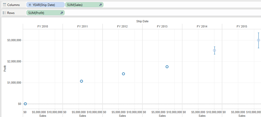
In the following example, forecast data is indicated by lighter shaded circles, and the prediction intervals are indicated by lines ending in whiskers:
Enhancing Forecasts
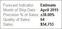
For each forecast value, consider verifying the quality or precision of your forecast by dragging another instance of the forecast measure from the Data pane to the Detail shelf on the Marks card and then after right-clicking the field to open the content menu, choosing one of the available options:
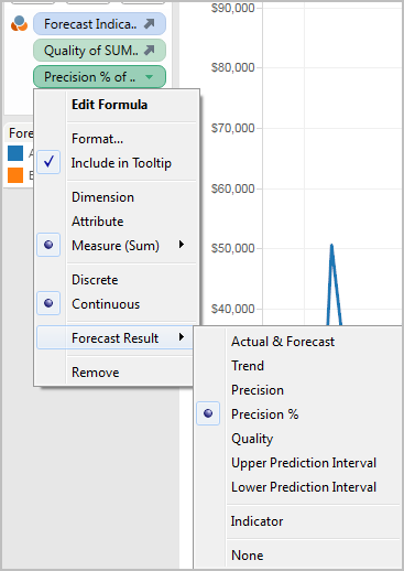
For descriptions of these options, see Forecast Field Results.
You can repeat the process to add additional result types for each forecast value. See "Changing the Forecast Result" type in Forecast Field Results for information on changing the result type.
By adding such result types to the Details shelf, you add information about the forecast to tooltips for all marks that are based on forecasted data.