Rebrand a Dashboard
Tableau Desktop builds visual best practices into its default formatting settings so that your visualizations look great from the start. But you might want to change formatting settings for a dashboard—for example, to align them with your organization's brand.
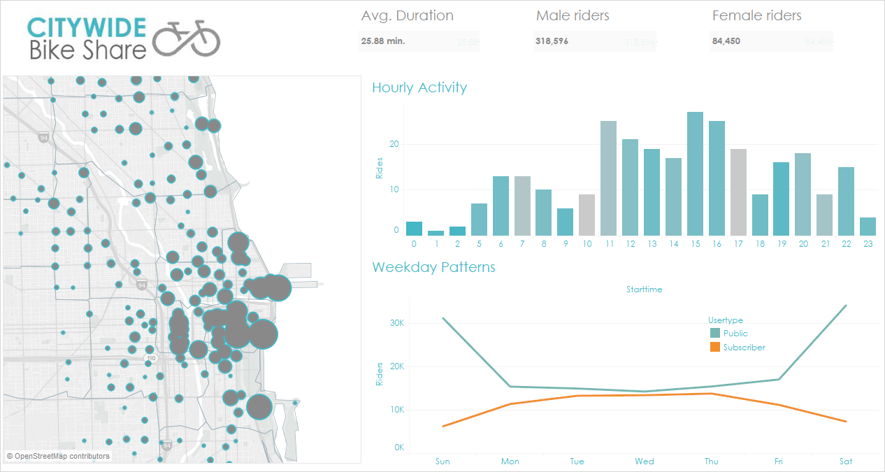
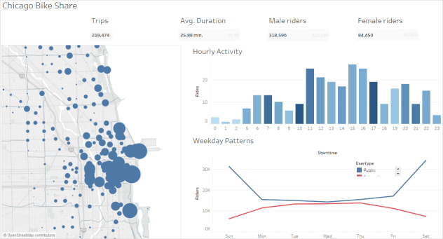
This article steps you through a dashboard rebranding process for a fictitious organization called Citywide Bike Share. Its brand includes turquoise, orange, and gray for its colors and Century Gothic for its font. The overall look is light and uncluttered and, of course, it's all about bikes!
| Before | After |
|---|---|
|

|
Change the fonts and font color of your titles
Fonts and colors are usually an important part of an organization's brand. The quickest way to make a fast, large-scale change to all the titles in your dashboard is to change them at the workbook level. A workbook is the largest possible container for formatting settings.
-
Click Format > Workbook.
-
Make your changes under Fonts, in the Format Workbook pane.
Here we've changed the font to Century Gothic and the font color to turquoise. We've chosen to change every title in the workbook, but you could also change the look of individual titles.
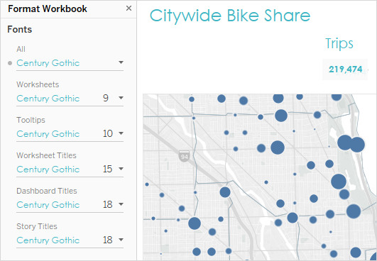
If the font you want to use doesn't exist in Tableau by default, you can add it. See Use Custom Fonts for details.
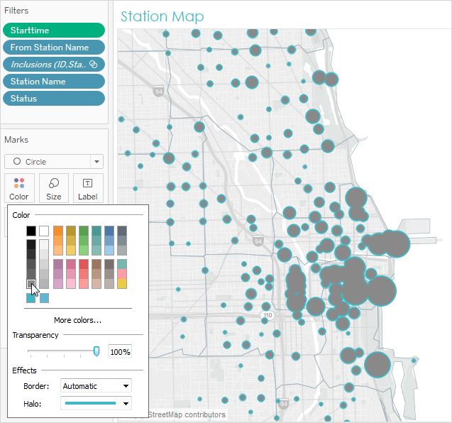
Change the marks colors
Marks represent data in a view. In this rebranding scenario, the marks show bike share locations. Changing marks colors is another way to communicate your organization's brand to your audience. For certain types of marks, you can also add and format halos, which is a colored ring around a mark.
-
Go a view on your dashboard and click Go to Sheet from the view's shortcut menu.
-
In the view, click Color on the Marks card.
-
Make your new color selection.
Here we've changed the marks in the Chicago Ride Share map to use gray with a turquoise halo:
-
Repeat the above steps for every view in your dashboard.
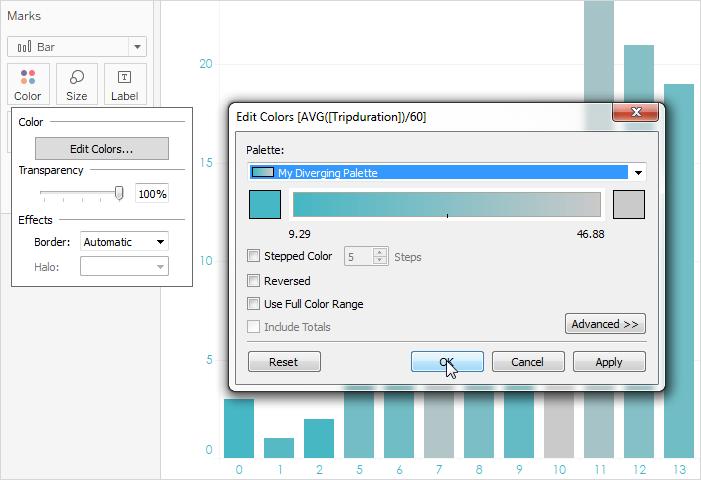
If a color you want to use isn't available, you can create your own custom palette. See Create Custom Color Palettes for details. For example, here we've changed the colors in the bar chart by created a custom diverging palette.
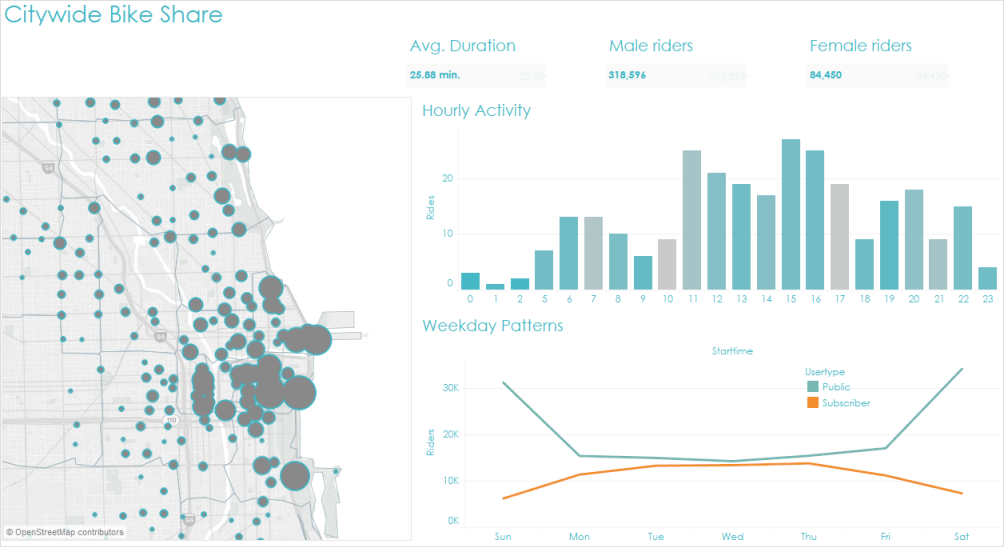
Now, with just a few changes to fonts and marks colors, the dashboard branding is already taking shape.
Customize your tooltips
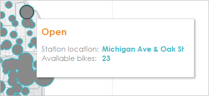
Tooltips appear when you hover the mouse pointer over a mark. Tooltips appear by default for most views. They're a great way to reinforce your brand and tell a better story.
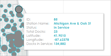
Here's what the map tooltips looked like by default:
-
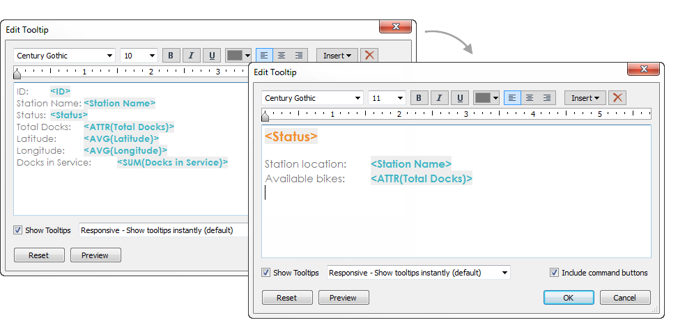
Go to the view's worksheet and click Worksheet > Tooltip.
-
Confirm that the tooltip has the details you want to display. You can change fonts, order, wording, alignment, and color.
For this rebranding scenario, we reduced the number of items displayed in the tooltip so that it's easier for users to quickly see what they're most interested in. We also reworded a few items and added the color orange as a contrasting, brand-appropriate color:
Here's what the map tooltips look like now:
Add an image or logo
Adding your own images can also be a way to bring your organization's brand into a workbook. For example, you can import a logo and use it at the top of your dashboard instead of displaying the default dashboard title.
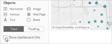
To remove the title and add an image:
-
In the Dashboard pane, stop displaying the dashboard title by clearing the Show dashboard title check box in the lower left corner.
-
Drag the Image object to the area where you want to display your logo. You may also need to adjust or remove other dashboard objects.
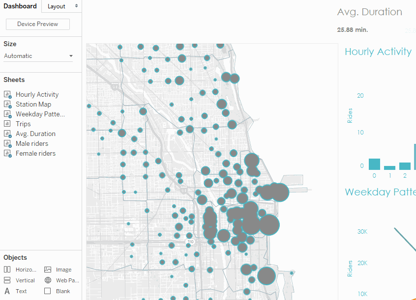
Click the image to replay it.Here's our final, rebranded workbook: