Add Axes for Multiple Measures in Views
There are several different ways to compare multiple measures in a single view. You can:
Create individual axes for each measure.
Blend two measures to share an axis.
Add dual axes where there are two independent axes layered in the same pane.
In any of these cases you can customize the marks for each axis to use multiple mark types and add different levels of detail. Views that have customized marks are called combination or combo charts.
Note: For details on how to edit axes, see Edit Axes.
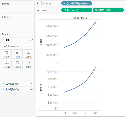
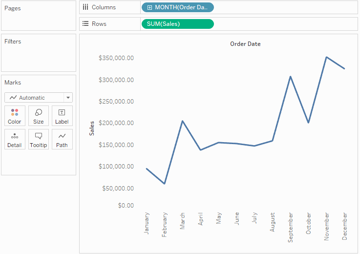
To add individual axes for each measure, drag measures to the Rows and Columns shelves.
Adding a continuous field on the Rows shelf adds an additional axis to the rows of the table.
Adding a continuous field on the Columns shelf adds an additional axis to the columns of the table.
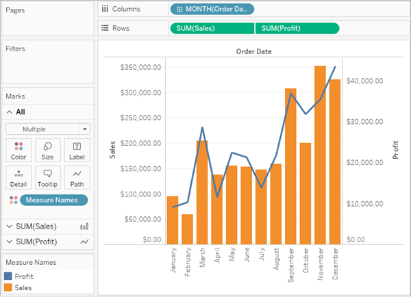
The example below shows quarterly sales and profit. The Sales and Profit axes are individual rows in the table and have independent scales.
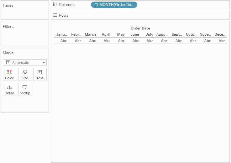
The Order Date field on the Columns shelf is a discrete date dimension. Because it is discrete, it creates headers rather than an axis. For details on how to edit axes, see Edit Axes.
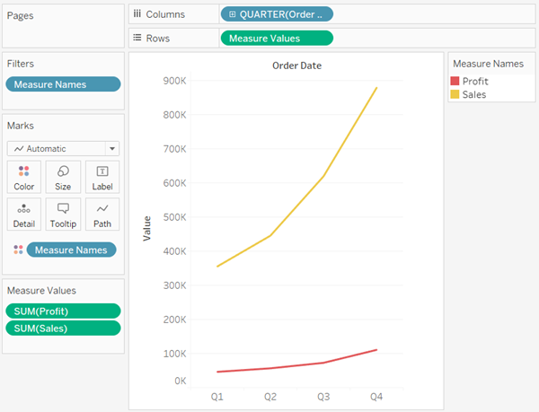
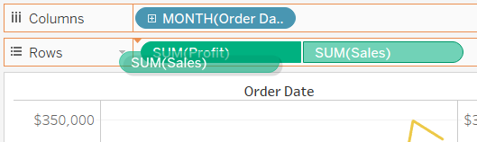
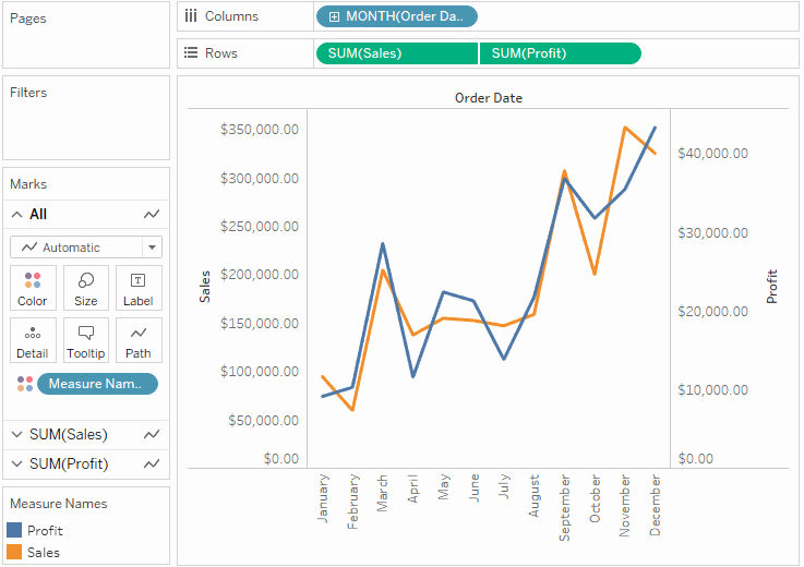
Measures can share a single axis so that all the marks are shown in a single pane.
To blend multiple measures, drag one measure or axis and drop it onto an existing axis.
Instead of adding rows and columns to the view, when you blend measures there is a single row or column and all of the values for each measure is shown along one continuous axis. For example, the view below shows quarterly sales and profit on a shared axis.
Note: If you drag a measure on to the canvas and only see a single ruler indicator instead of the double ruler indicator shown below, Tableau creates dual axes instead of a blended axis. For more information about how to create dual axes, see Compare two measures using dual axes.
Blending measures uses the Measure Names and Measure Values fields, which are generated fields that contain all of the measure names in your data source and all of the measure values. The shared axis is created using the Measure Values field. The Measure Names field is added to Color on the Marks card so that a line is drawn for each measure. Finally, the Measure Names field is filtered to only include the measures you want to blend.
Note: Blending axes is most appropriate when comparing measures that have a similar scale and units. If the scales of the two measures are drastically different, the trends may be distorted.
You can compare multiple measures using dual axes, which are two independent axes that are layered on top of each other. Dual axes are useful for analyzing two measures with different scales.
To add a measure as a dual axis, drag the field to the right side of the view and drop it when you see a black dashed line appear.
You can also right-click (control-click on Mac) the measure on the Columns or Rows shelf and select Dual Axis.
The result is a dual axis view where the Profit axis corresponds to the blue line and the Sales axis corresponds to the orange line.
You can add up to four layered axes: two on the Columns shelf and two on the Rows shelf.
To align the two axes in a dual axes chart to use the same scale, right-click (control-click on Mac) the secondary axis, and select Synchronize Axis. This aligns the scale of the secondary axis to the scale of the primary axis.
In this example, the Sales axis is the secondary axis and the Profit axis is the primary axis.
Note: To synchronize axes, the data types for both measures must be the same. If the data types for your measures are different, see the section below.
You can synchronize dual axes for numeric data types that don't match. For example, you can synchronize an axis that uses an integer data type and an axis that uses decimal data type.
If you would like to change which axis is the primary, and which axis is the secondary, select the field on the Columns or Rows shelf that is the secondary, and drag it in front of the primary field on the shelf until you see an orange triangle appear.
In this example, you can select the SUM(Sales) field on the Rows shelf, and drag it in front of the SUM(Profit) field. The Sales axis is now the primary and the Profit axis is the secondary.
The Synchronize Axis option ensures that you make a scaled and correct comparison in a dual axes chart. However, sometimes this option may not be available (grayed out). This is because the data type of one of the axes is different from the other.
Note: In a chart with dual axes, starting with version 2018.1, you can synchronize dual axes for numeric data types that don't match. For example, you can synchronize an axis that uses an integer data type and an axis that uses decimal data type.
To resolve this issue, you must change the data type of one of the axes. Follow the example below to change the data type for an axis.
Click the new Worksheet
 icon to open a new worksheet.
Drag Order Date to Columns, then click the drop-down arrow on the field on the shelf and select Monthfrom the context menu.
Drag Sales to Rows, then drag Quantity to the right side of the view and drop it when you see a black dashed line appear to create a dual axis.
If you right-click on the Quantity Axis, you can see that the Synchronize Axis option is grayed out
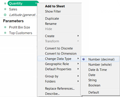
In the Data pane, click on the drop-down arrow on the Quantity field, and select Change Data Type > Number (decimal) in the context menu. This changes the data type for this field.
Replace the Quantity measure on the view.
Right-click the secondary axis, and then select Synchronize Axis.
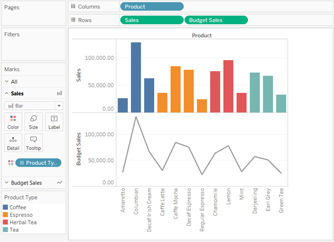
Select the Marks card for the measure that you want to customize. There is a Marks card for each measure on the Rows and Columns shelves.
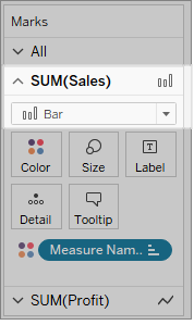
Select a new mark type for the measure.
Any changes to the mark type, shape, size, color, detail and other mark properties will be applied to the selected measure.
For example, in the view below the Sales Marks card is active. The Mark Type has been changed to Bar and when Product Type is placed on Color on theSales Marks card, the encoding and level of detail is only applied to the Sales marks. The Budget Sales mark is not broken down by Product Type.
Tips
Select a field in the Marks card to modify only its properties.
Select the All Marks card to modify properties for all measures at once.
To change the order of a field's marks in the view, right-click its axis, and then select Move marks to front.
When working with multiple measures in a view, you can customize the mark type for each distinct measure. Because each measure can have customized marks, you can customize the level of detail, size, shape, and color encoding for each measure too.
For example, you could create a view that uses two measures in dual axes. One measure shows Profit with a line mark, and the other measure shows Sales with bar marks. You could also choose to display the measures as individual axes or blended axes.
To create a combo chart like this example
Connect to the Sample - Superstore data source.
Drag the Order Date measure to the Columns shelf, and then click Order Date change Year to Month.
Drag the Sales measure to the Rows shelf.
Drag the Profit measure to the right side of the view and drop it when you see a black dashed line appear.
Click the Sales card. Change the Sales mark type to Bar.
Optional: To adjust the colors used for the Sales and Profit marks:
- Click the All card, click Color, and then click Edit Colors.
- Click the Profit data item, and then click a different color in the palette. Click the Sales data item, and then click a different color in the palette.
- Click Apply, and then click OK.