Reference Lines, Bands, Distributions, and Boxes
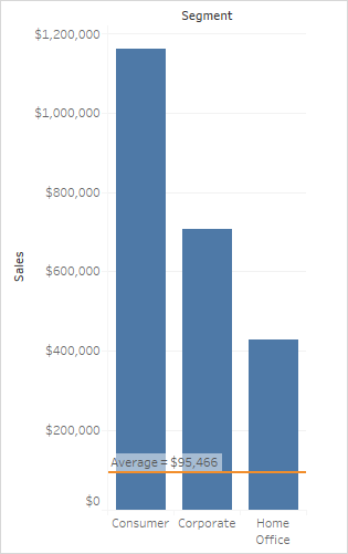
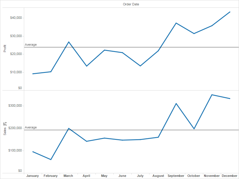
You can add a reference line, band, distribution, or box plot to identify a specific value, region, or range on a continuous axis in a Tableau view. For example, if you are analyzing the monthly sales for several products, you can include a reference line at the average sales mark so you can see how each product performed against the average.
Tableau lets you add as many reference lines, bands, distributions, and box plots to a view as you require.
You can add reference lines, bands, distributions, or (in Tableau Desktop but not on the web) box plots to any continuous axis in the view.
Reference Lines - You can add a reference line at a constant or computed value on the axis. Computed values can be based on a specified field. You can also include confidence intervals with a reference line.
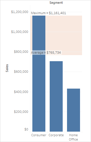
Reference Bands - Reference bands shade an area behind the marks in the view between two constant or computed values on the axis.
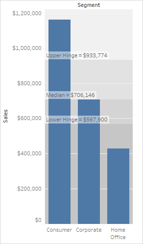
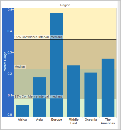
Reference Distributions - Reference distributions add a gradient of shading to indicate the distribution of values along the axis. Distribution can be defined by percentages, percentiles, quantiles (as in the following image), or standard deviation.
Reference distributions can also be used to create bullet charts. See Add a Bullet Graph later in this article for specifics.
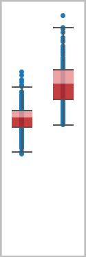
Box Plots - Box plots (also known as box and whisker charts) are a standardized graphic for describing the distribution of values along an axis. Box plots show quartiles (also known as hinges) and whiskers. Tableau provides different box plot styles, and allows you to configure the location of the whiskers and other details.
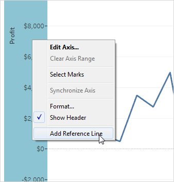
You can add a reference line to any continuous axis in the view.
To add a reference line:
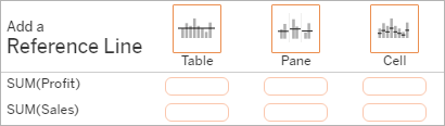
Drag Reference Line from the Analytics pane into the view. Tableau shows the possible destinations. The range of choices varies depending on the type of item and the current view.
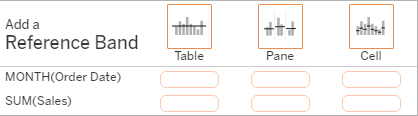
In a simple case, the drop target area offers three options:
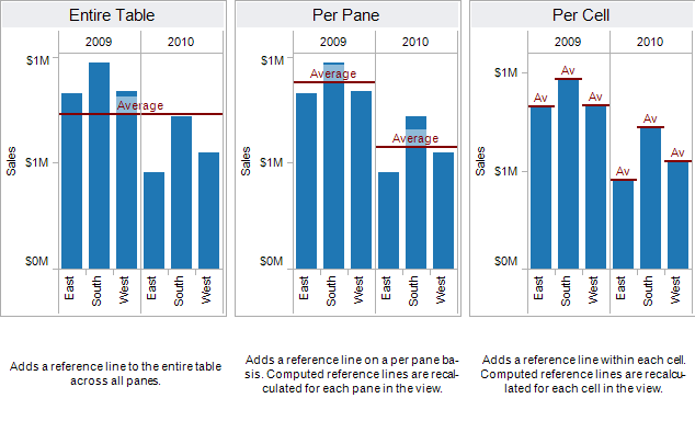
The view above is from a web editing session. In Tableau Desktop, the process is the same but the user interface looks a bit different. The terms Table, Pane and Cell define the scope for the item:
For a more complicated view—for example, if the view contains a line chart with multiple or dual axes—Tableau shows you an expanded drop target area:
If you drop the item in one of the three larger boxes in the header (for example, the Table box), a separate reference line is added for each continuous field in the view:
But if you drop the item in any of the lower boxes that are aligned with a specific continuous field, the line is added on the corresponding axis, with the specified scope.
When you drop the line in the target area, Tableau displays a dialog box:
Tableau Desktop version Web version 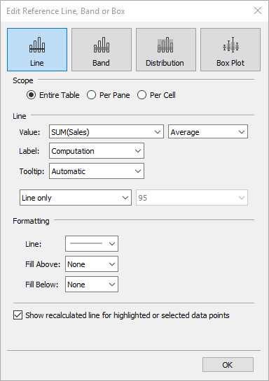
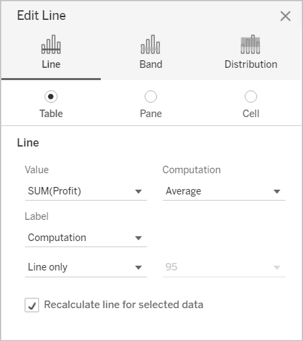
The Line option is already selected at the top of the dialog box.
Select a continuous field from the Value field to use as the basis for your reference line. You can also select a parameter.
You cannot select a continuous field that isn't currently in the view as the basis for your reference line. If you want to use such a continuous field, do the following:
Drag the continuous field from the Data pane to the Details target on the Marks card.
Change the continuous field's aggregation if necessary.
This will not change the view, but it will allow you to use that continuous field as the basis for your reference band.
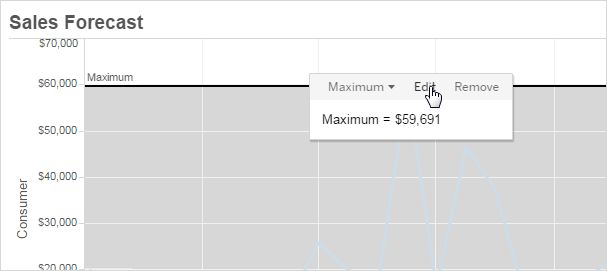
Click on the reference line in the view and choose Edit to re-open the Edit Line dialog box.
Select an aggregation. The aggregations that are displayed depend on the continuous field you select:
Total - places a line at the aggregate of all the values in either the cell, pane, or the entire view. This option is particularly useful when computing a weighted average rather than an average of averages. It is also useful when working with a calculation with a custom aggregation. The total is computed using the underlying data and behaves the same as selecting one of the totals option the Analysis menu.
Sum - places a line at the SUM of all the values in either the cell, pane, or entire view.
Constant- places a line at the specified value on the axis.
Minimum - places a line at the minimum value.
Maximum - places a line at the maximum value.
Average - places a line at the average value along the axis.
Median- places a line at the median value.
Select how you want to label the line:
None –select this option to not show a label for the reference line.
Value – select this option to show a label corresponding to the line's value on the axis.
Computation – select this option to display the name of the continuous field that is the basis for your reference line and any computation that is performed.
Custom – select this option to build a custom label in the text box. You can use the menu to the right of the text box to insert values such as the computation or the value. You can also type text directly into the box, so you could create a value such as
<Field Name> = <Value>.
- Select how you want the tooltip to appear.
None –select this option to not show a tooltip for the reference line.
Automatic – select this option to show the default tooltip for the reference line.
Custom – select this option to build a custom label in the tooltip. You can use the menu to the right of the text box to insert values such as the computation or the value. You can also type text directly into the box, so you could create a value such as
<Field Name> = <Value>.
Specify whether to display the line with a confidence interval, just the line, or just the confidence interval.
Confidence interval distribution bands shade the region in which the population average will fall n of the time, where n is the value you select in the drop-down on the right. You can choose one of the listed numeric values or select a parameter:
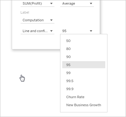
The higher the value you select, the wider the bands will be.
In Tableau Desktop, you can also specify formatting options for the line.
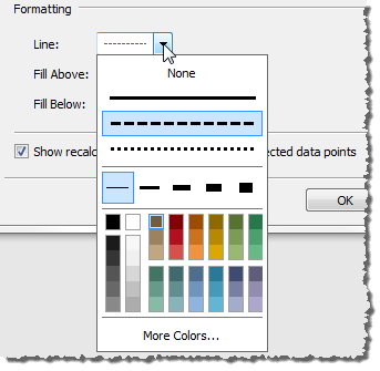
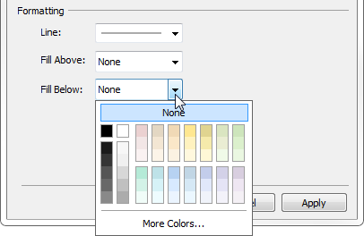
Optionally, add a fill color above and below the line.
When you are displaying a line and a confidence interval, the shading will be darker within the confidence interval, and lighter beyond it:
When you are displaying a confidence interval without a line, the fill colors are disregarded, though your settings are retained and then applied if you decide later to show a line.
Specify whether to Show recalculated line for highlighted or selected data points. For more information, see Compare marks data with recalculated lines.
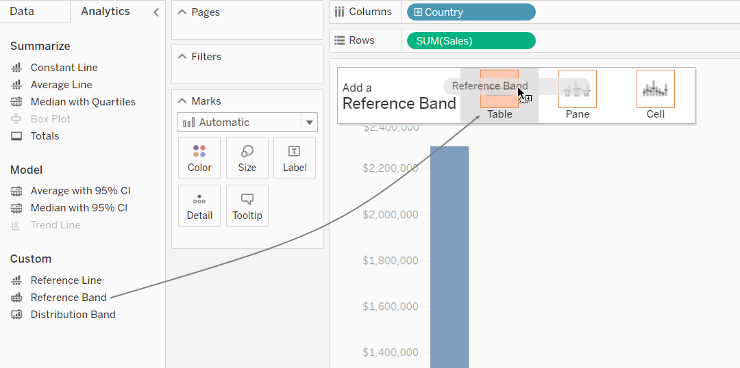
Reference bands are shaded areas behind the marks in the view between two constant or computed values on the axis. You can add reference bands to any continuous axis in the view.
To add a reference band:
Drag Reference Band from the Analytics pane into the view. Tableau shows the possible destinations. The range of choices varies depending on the type of item and the current view.
In a simple case, the drop target area would offer just three options:
The terms Table, Pane, and Cell define the scope for the item:
For a more complicated view—for example, if the view contains multiple or dual axes—Tableau shows you an expanded drop target area that looks like this:
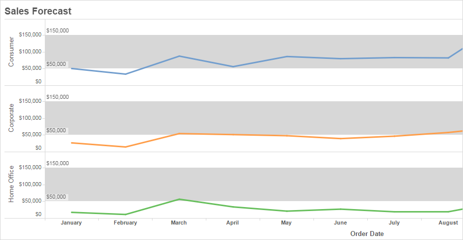
If you drop the item in one of the three larger boxes in the header (for example, the Table box), a separate set of bands is added for each continuous field in the view:
But if you drop the item in any of the lower boxes aligned with a specific continuous field, the band is added on the corresponding axis, with the specified scope.
When you drop the band in the target area, Tableau displays a dialog box:
Tableau Desktop version Web version 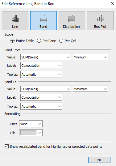
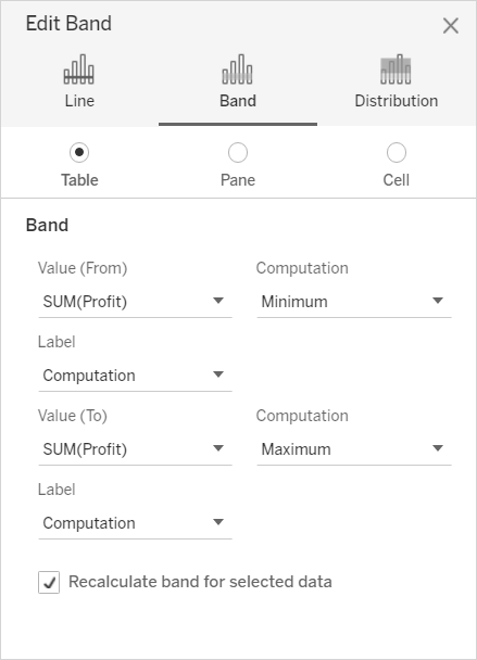
The Band area is already selected at the top of the dialog box.
Select two continuous fields to use as the basis for your reference band one in each Value field. You can also select a parameter from the drop-down lists. Do not select the same continuous field and aggregation in both areas.
You cannot select a continuous field that isn't currently in the view as the basis for your reference band. If you want to use such a continuous field, do the following:
Drag the continuous field from the Data pane to the Details target on the Marks card.
Change the continuous field's aggregation if necessary.
This will not change the view, but it will allow you to use that continuous field as the basis for your reference band.
Click on the reference band in the view and choose Edit to re-open the Edit Band dialog box, and select the continuous field in in the Value (From) area and one in the Value (To) area.
Select a computation for each value. The aggregations that are displayed depend on the continuous field you select:
Total - extends the band to a value that is at the aggregate of all the values in either the cell, pane, or the entire view. This option is particularly useful when computing a weighted average rather than an average of averages. It is also useful when working with a calculation with a custom aggregation. The total is computed using the underlying data and behaves the same as selecting one of the totals option the Analysis menu.
Sum - extends the band to a value that is at the SUM of all the values in either the cell, pane, or entire view.
Constant- extends the band to a value that is at the specified value on the axis.
Minimum - extends the band to a value that is at the minimum value.
Maximum - extends the band to a value that is at the maximum value.
Average - extends the band to a value that is at the average value along the axis.
Median- extends the band to a value that is at the median value.
Select how you want to label the bands:
None –select this option to not show a label for the reference band.
Value – select this option to show a label corresponding to the band's value on the axis.
Computation – select this option to display the name of the continuous field that is the basis for your reference band and any computation that is performed.
Custom – select this option to build a custom label in the text box. You can use the menu to the right of the text box to insert values such as the computation or the value. You can also type text directly into the box, so you could create a value such as
<Field Name> = <Value>.
Select how you want the tooltip to appear.
None –select this option to not show a tooltip for the reference band.
Automatic – select this option to show the default tooltip for the reference band.
Custom – select this option to build a custom label in the tooltip. You can use the menu to the right of the text box to insert values such as the computation or the value. You can also type text directly into the box, so you could create a value such as
<Field Name> = <Value>.
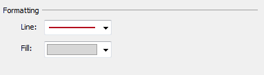
In Tableau Desktop, you can also specify formatting options for the bands. You can mark the two values with a line or select a shading color for the band.
- Specify whether to Show recalculated line for highlighted or selected data points. For more information, see Compare marks data with recalculated lines.
When you add a reference distribution, you specify one, two, or more values. With one value, the result is a line; with two or more values the result is a set of one, two, or more bands.
To add a reference distribution:
Drag Distribution Band from the Analytics pane into the view. Tableau shows the possible destinations. The range of choices varies depending on the type of item and the current view.
Select a scope for the distribution. The terms Table, Pane, and Cell define the scope for the item:
Select the computation that will be used to create the distribution:
Percentages - shades the interval between the specified percentage values. Use a comma to separate two or more percentage values (for example,
60, 80), and then specify which measure and aggregation to use for the percentages.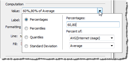
Percentiles - shades intervals at the specified percentiles. Choose Enter a value from the Value drop-down list, and then enter two or more numerical values, delimited by commas (for example,
60,80or25, 50, 75).Quantiles - breaks the view into the specified number of tiles using shading and lines. When you select this computation, you must also specify the number of tiles (from 3 to 10, inclusive). For example, if you select 3, Tableau calculates the boundaries between the first, second and third terciles by calling the general quantile function and asking for the 33.33 and the 66.66 quantiles. It then shades the three terciles differently.
Tableau uses estimation type 7 in the R standard to compute quantiles and percentiles.
Standard Deviation - places lines and shading to indicated the specified number of standard deviations above and below the mean. When you select this option you must specify the factor, which is the number of standard deviations and whether the computation is on a sample or the population.
Specify how you want to label the distribution bands:
None –select this option to not show a label for the distribution bands.
Value – select this option to show a label corresponding to each distribution band's value on the axis.
Computation – select this option to display the name of the continuous field that is the basis for your distribution bands and any computation that is performed.
Custom – select this option to build a custom label in the text box. You can use the menu to the right of the text box to insert values such as the computation or the value. You can also type text directly into the box, so you could create a value such as
<Field Name> = <Value>.
- Specify whether to Show recalculated band for highlighted or selected data points. For more information, see Compare marks data with recalculated lines in the Tableau Desktop online help.
Reference distributions can also be used to create bullet graphs. A bullet graph is a variation of a bar graph developed to replace dashboard gauges and meters. The bullet graph is generally used to compare a primary measure to one or more other measures in the context of qualitative ranges of performance such as poor, satisfactory, and good. You can create a bullet graph by adding a distribution to indicate the qualitative ranges of performance, and a line to indicate the target. The following procedure uses Show Me to make this process easier.
Select one or more dimensions, and two measures in the Data pane. The bullet graph will compare measure values. For example, budget vs. actual; actual vs. target; etc. Select multiple fields in the Data pane by holding down the Ctrl key as you click fields. If you are using the Superstore sample workbook, you can select the fields show below:
Click the Show Me button in the toolbar.
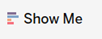
Select Bullet Graph in the Show Me pane.
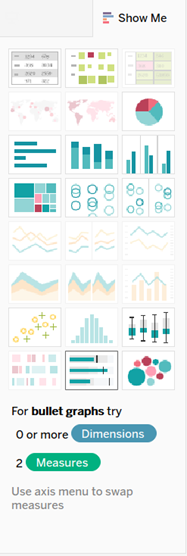
Tableau adds a reference distribution that is defined at 60% and 80% of the Average of the measure on Detail. It also adds a reference line that marks the Average of that same measure. The other measure is placed on the Rows shelf.
You can edit either of these to change its definition. For example, you may want to add 100% to the set of distribution band values, or draw a line at a constant value. Click on the outer edge or a distribution band, or on the line, and choose Edit.
In Tableau Desktop, but not on the web, you can add box plots to a continuous axis.
Use box plots, also known as box-and-whisker plots, to show the distribution of values along an axis.
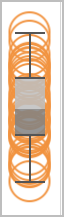
Boxes indicate the middle 50 percent of the data (that is, the middle two quartiles of the data's distribution). You can configure lines, called whiskers, to display all points within 1.5 times the interquartile range (in other words, all points within 1.5 times the width of the adjoining box), or all points at the maximum extent of the data, as shown in the following image:

Boxplots are also available from the Show Me pane when you have at least one measure in the view:
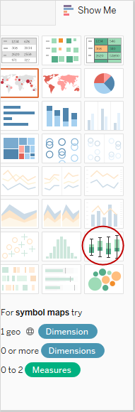
For information on Show Me, see Use Show Me to Start a View
To add a box plot:
Right-click (Control-click on a Mac) on a quantitative axis and select Add Reference Line.
In the Add Reference Line, Band, or Box dialog box, select Box Plot.
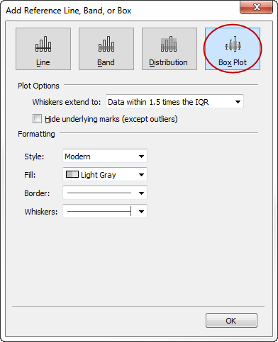
Under Plot Options, specify placement for the whiskers:
Data within 1.5 times the IQR - places whiskers at a location that is 1.5 times the interquartile range—that is, 1.5 times further out than the width of the adjoining box. This is also known as a schematic box plot.
Maximum extent of the data - places whiskers at the farthest data point (mark) in the distribution. This is also known as a skeletal box plot.
Specify whether to Hide underlying marks (except outliers)—that is, whether to hide all marks except those beyond the whiskers.
Configure the appearance of the plot by selecting a Style , Fill, Border, and Whiskers.
Box Plot Alternatives: Show Me Vs. Add Reference Line, Band, or Box
The difference between adding a box plot using Show Me and adding a box plot using Add Reference Line is that with Show Me, the box plot is your visualization, whereas with Add Reference Line, Band, or Box, you are adding a box plot to an existing visualization. For example, you could create the following view by first selecting a circle view in Show Me, and then adding a box plot from Add Reference Line:
You can edit existing lines, bands, or distributions. To do this, click on a line or on the outer edge of a band and choose Edit to reopen the edit dialog box for that object.
To remove a reference line, band, or distribution, click on a line or on the outer edge of a band and choose Remove. You can also drag a line or band off the view.