Create Maps that Show a Path Over Time in Tableau
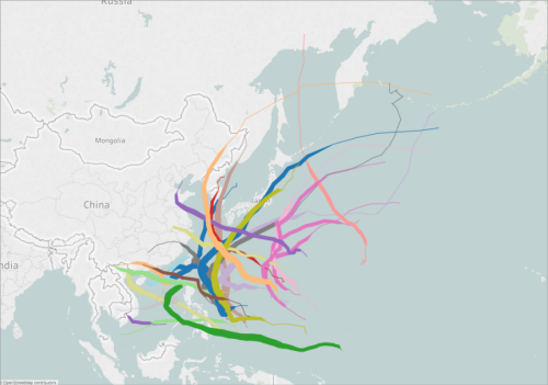
You can create maps in Tableau Desktop that show a path over time, similar to the example below. These types of maps are called flow maps, or path maps.
Flow maps are great for when you want to show where something went over time, such as the path of a storm.
This topic illustrates how to create a flow map using an example. Follow the example below to learn how to set up your data source, and build the view for a flow map.
Your data source
Note: Starting in Tableau version 10.4, you can connect to spatial files that contain linear geometries. If you have spatial data with linear geometries, you may not need to perform the steps below. To learn how to create a map using spatial data with linear geometries, see Create Tableau Maps from Spatial Files(Link opens in a new window)
To create a flow map, your data source should include the following types of information:
- Latitude and longitude coordinates for each data point in a path
- A column to define the order to connect the points (this can be date information, or manually applied numbers, such as 1, 2, 3, 4, 5)
- A unique ID for each path
- Enough data points to shape each path into a line
For example, the following table is a snippet of the Storm data source, which is included in the Create Flow Maps in Tableau Example Workbook(Link opens in a new window) on Tableau Public. It contains data on the paths of storms, and has columns for Latitude and Longitude, Date, and Storm Name. In this example, the Date column is used as an order to connect the data points, and the Storm Name column is used as a unique ID for each path.
Though only a few data points for the storm PAKHAR are shown in this example, the actual data source has enough entries to provide a detailed path for every storm recorded in 2012.
Note that the table also includes two optional columns: Basin and Wind Speed. These fields can be used to quickly filter and add visual detail to the view. You'll see how in the section, Build the map view.
| Storm Name | Date | Latitude | Longitude | Basin | Wind Speed (kt) |
| PAKHAR | 3/26/12 12:00:00 AM | 9.5000 | 115.700 | West Pacific | 0 |
| PAKHAR | 3/26/12 6:00:00 AM | 9.5000 | 115.400 | West Pacific | 0 |
| PAKHAR | 3/26/12 12:00:00 PM | 9.5000 | 115.100 | West Pacific | 0 |
| PAKHAR | 3/26/12 6:00:00 PM | 9.4000 | 114.800 | West Pacific | 0 |
| PAKHAR | 3/27/12 12:00:00 AM | 9.4000 | 114.500 | West Pacific | 0 |
| PAKHAR | 3/27/12 6:00:00 AM | 9.4000 | 114.300 | West Pacific | 35 |
Basic map building blocks:
| Columns shelf: | Longitude (continuous measure, longitude geographic role assigned) |
| Rows shelf: | Latitude (continuous measure, latitude geographic role assigned) |
| Detail: | Dimension (unique ID for each path) |
| Path: | Date field or order field to define order to connect the data points |
| Mark type: | Line |
To follow along with this example, download the Create Flow Maps in Tableau Example Workbook(Link opens in a new window) from Tableau Public, and open it in Tableau Desktop.
Open a new worksheet.
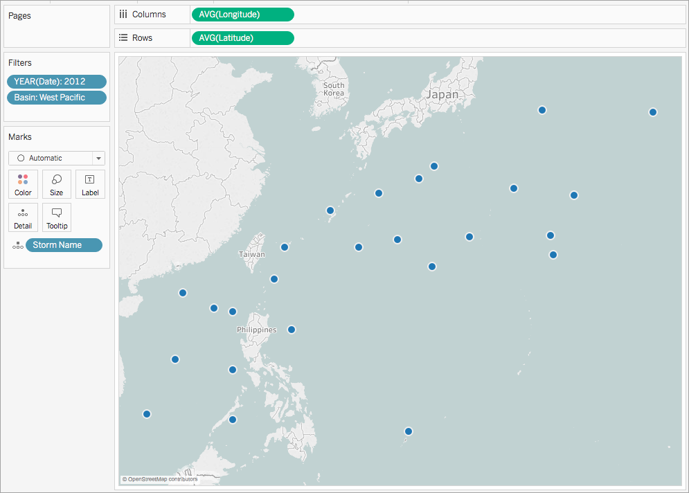
In the Data pane, under Measures, double-click Latitude and Longitude.
The Latitude and Longitude fields are added to the Columns and Rows shelves, and a map view with one data point is created.
From Dimensions, drag Storm Name to Detail on the Marks card.
The map view updates with a data point for every storm in the data source. In the next steps, you will narrow the storms down to only those that occurred in the western Pacific Ocean in 2012.
From Dimensions, drag Date to the Filters shelf.
In the Filter Field [Date] dialog box that appears, select Years, and then click Next.
In the Filter [Year of Date] dialog box that appears, click 2012, and then click OK.
The map view updates to show only the storms that occurred in 2012.
From Dimensions, drag Basin to the Filters shelf.
In the Filter Field [Basin] dialog box that appears, select West Pacific, and then click OK.
The map view updates to show only storms that occurred in the western part of the Pacific Ocean.
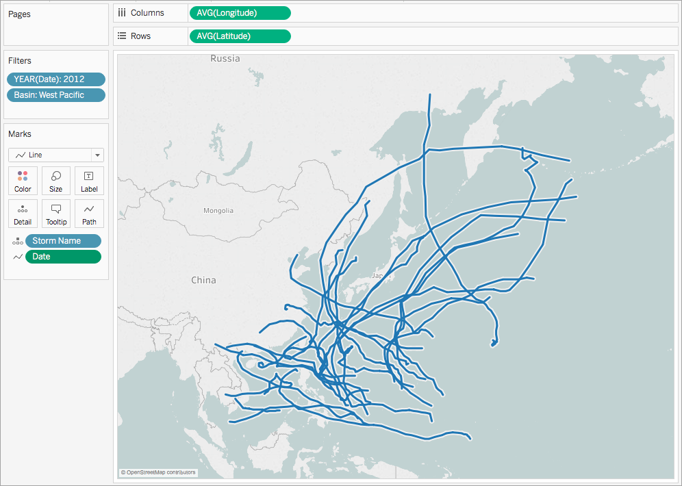
On the Marks card, click the mark-type drop-down and select Line.

A Path button appears on the Marks card, and the map view updates with a line connecting every data point.

From Dimensions, drag Date to Path on the Marks card.
The line disappears. This is because the Date field is set to discrete years. Since the date field in the Storm data source includes day, month, year, and time, this is not the correct level of detail for this field.
On the Marks card, right-click the YEAR(Date) field and select Exact Date.
Now the map view updates with a data point for every recorded date and time. You can now see the individual paths of each storm.
From Measures, drag Wind Speed to Size on the Marks card.
The map view updates to show the varying wind speeds along each storm path.
On the Marks card, right-click the SUM(Wind Speed) field and select Measure > Average.
From Dimensions, drag Storm Name to Color on the Marks card.
Each storm path is assigned a color and the flow map is now complete.
You can now see the paths for every recorded storm that occurred in the West Pacific basin in 2012. You can also see at what point in their path their wind speeds were strongest.

See also:
Mapping Concepts in Tableau(Link opens in a new window)
Create Maps that Show Paths Between Origins and Destinations in Tableau
Tableau Community post: Origin-Destination Maps (or Flow Maps)(Link opens in a new window)