Mapping Concepts in Tableau
If you want to analyze your data geographically, you can plot your data on a map in Tableau. This topic explains why and when you should put your data on a map visualization. It also describes some of the types of maps you can create in Tableau, with links to topics that demonstrate how to create each one.
If you're new to maps in Tableau, this is a great place to start learning.
There are many reasons to put your data on a map. Perhaps you have some location data in your data source? Or maybe you think a map could really make your data pop? Both of those are good enough reasons to create a map visualization, but it’s important to keep in mind that maps, like any other type of visualization, serve a particular purpose: they answer spatial questions.
You make a map in Tableau because you have a spatial question, and you need to use a map to understand the trends or patterns in your data.
But what is a spatial question? Some examples might be:
Which state has the most farmers markets?
Where are the regions in the U.S. with the high obesity rates?
Which metro station is the busiest for each metro line in my city?
Where did the storms move over time?
Where are people checking out and returning bikes from their local bike share program?
All of these are spatial questions. However, is a map the best way to answer them?
If you have a spatial question, a map view might be a great way to answer it. However, that might not always be the case.
Take for example, the first question from the previous list: Which state has the most farmers markets?
If you had a data source with a list of farmers markets per state, you might create a map view like the one below. Can you easily tell the difference between New York and California? Which one has more farmers markets?
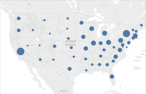
What if you create a bar chart instead? Now is it easy to spot the state with the most farmers markets?

The above example is one of many where a different type of visualization would be better to answer a spatial question than a map.
So when do you know if you should use a map view?
One general rule is to ask yourself whether you could answer your question faster, or easier with another visualization. If the answer is yes, then perhaps a map view isn’t the best visualization for the data you’re using. If the answer is no, then take the following into account:
Maps that answer questions well have both appropriate data representation, and attractive data representation. In other words: the data isn’t misleading, and the map is appealing.
If your map is beautiful, but the data is misleading, or not insightful, you run the risk of people misinterpreting your data. That’s why it’s important to create maps that represent your data accurately, as well as attractively.
With Tableau, you can create the following common map types:
- Proportional symbol maps
- Choropleth maps (filled maps)
- Point distribution maps
- Density maps (heatmaps)
- Flow maps (path maps)
- Spider maps (origin-destination maps)
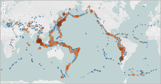
Proportional symbol maps are great for showing quantitative data for individual locations. For example, you can plot earthquakes around the world and size them by magnitude.
For more information about proportional symbol maps, and to learn how to create them in Tableau, see Create Maps that Show Quantitative Values in Tableau(Link opens in a new window).
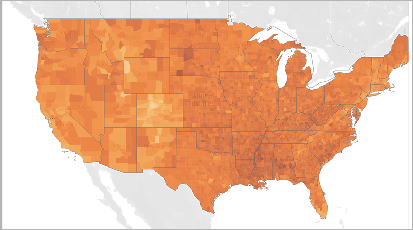
Also known as filled maps in Tableau, Choropleth maps are great for showing ratio data. For example, if you want to see obesity rates for every county across the United States, you might consider creating a choropleth map to see if you can spot any spatial trends.
For more information about Choropleth maps, and to learn how to create them in Tableau, see Create Maps that Show Ratio or Aggregated Data in Tableau(Link opens in a new window).
Point distribution maps can be used when you want to show approximate locations and are looking for visual clusters of data. For example, if you want to see where all the hailstorms were in the U.S. last year, you can create a point distribution map to see if you can spot any clusters.
For more information about point distribution maps, and to learn how to create them in Tableau, see Create Maps that Highlight Visual Clusters of Data in Tableau(Link opens in a new window).

Density maps, also called heatmaps, can be used when you want to show a trend for visual clusters of data. For example, if you want to find out which areas of Manhattan have the most taxi pickups, you can create a density map to see which areas are most popular.
For more information about density maps, and to learn how to create them in Tableau, see Create Heatmaps that Show Trends or Density in Tableau.

You can use flow maps to connect paths across a map and to see where something went over time. For example, you can track the paths of major storms across the world over a period of time.
For more information about flow maps, and to learn how to create them in Tableau, see Create Maps that Show a Path Over Time in Tableau(Link opens in a new window).

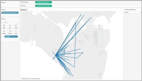
You can use a spider map to show how an origin location and one or more destination locations interact. For example, you can connect paths between metro stations to plot them on a map, or you can track bike share rides from an origin to one or more destinations.
For more information about spider maps, and to learn how to create them in Tableau, see Create Maps that Show Paths Between Origins and Destinations in Tableau (Link opens in a new window).

Before you get started with building map views in Tableau, review some of the following resources.
Get your geographic data into Tableau
Create Tableau Maps from Spatial Files(Link opens in a new window): If you have Esri Shapefiles, Mapinfo tables, or KML files, start here.
Geocode Locations Tableau Does Not Recognize and Plot Them on a Map(Link opens in a new window): If you have data that Tableau doesn’t recognize, start here.
Blend Geographic Data (Link opens in a new window): If you have geographic data you want to blend with another data source, start here.
Format your geographic fields
Assign Geographic Roles (Link opens in a new window): After you bring your geographic data into Tableau, you'll need to format that data for use in Tableau.
See also
Build-It-Yourself: Build a map view(Link opens in a new window)
Customize How Your Map Looks(Link opens in a new window)
Use Mapbox Maps(Link opens in a new window)
Use Web Map Service (WMS) Servers(Link opens in a new window)