Best Practices for Telling Great Stories
A good data story brings data and facts to life. Use this article for tips on best practices to use with Tableau's story points feature.
Before you start to build your story, take some time to think about the purpose of your story and what you want your viewers' journey to be. Is it a call to action, is it a simple narrative, or are you presenting a case?
If you're presenting a case, decide whether you want to present data points that lead up to a conclusion at the end, or start with a conclusion then show the supporting data points. The latter approach works well for a busy audience.
Finally, sketching out your story first on paper or a whiteboard can help you quickly identify problems with your sequence.
When you use the story feature, you are building a sequence of points. Each point can contain a view, dashboard, or even just text. Some stories show the same view throughout the story, with text annotations and different filters applied to different points to support the narrative arc.
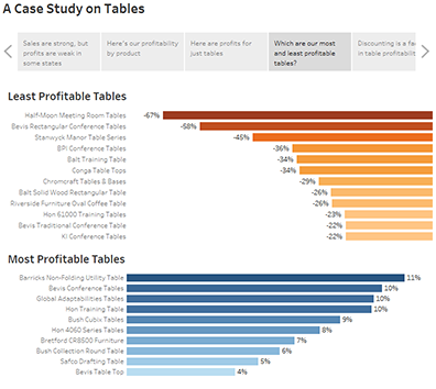
The following table describes seven different data story approaches you can take and provides an example for each. Each data story type is also illustrated in the Data Story Examples Workbook(Link opens in a new window) on Tableau Public. A single story can also use more than one approach—see Example - A Story That Examines a Trend.
| Data Story Type | Description |
Change Over Time | What it does: Uses a chronology to illustrate a trend. Discussions it starts: Why did this happen, or why does it keep happening? What can we do prevent or make this happen? |
Drill Down | What it does: Sets context so that your audience better understands what's going on in a particular category. Discussions it starts: Why is this person, place or thing different? How does the performance of this person, place, or thing compare? |
Zoom Out | What it does: Describes how something your audience cares about relates to the bigger picture. Discussion it starts: How does something you care about compare to the bigger picture? What effect does one area have on the bigger picture? |
Contrast | What it does: Shows how two or more subjects differ. Discussions it starts: Why are these items different? How can we make A perform like B? Which area should we focus on and which area is doing fine? |
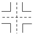
Intersections | What it does: Highlights important shifts when one category overtakes another. Discussions it starts: What causes these shifts? Are these shifts good or bad? How do these shifts affect other aspects of our plan? |
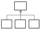
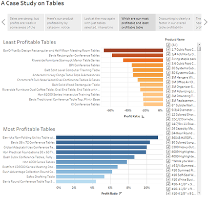
Factors | What it does: Explains a subject by dividing it into types or categories. Discussions it starts: Is there a particular category we should focus on more? How much do these items affect the metric we care about? |
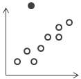
Outliers | What it does: Shows anomalies or where things are exceptionally different. Discussions it starts: Why is this item different? |
A common error is trying to cram too many views and dashboards into a single story. The result is too many points for your viewers to take in.
The clarity of each story point is also important. Take a step back and consider your story from the perspective of someone who's never seen it. Every element should serve a purpose. If captions, titles, legends, or grid lines aren't necessary, get rid of them!
| Before | After |
|---|---|
 |  |
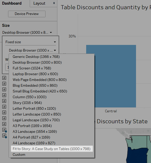
Dashboards are a common ingredient in Tableau stories. For dashboards that you plan to include in your story, you can use the Fit to option under Size on the Dashboard pane. It will resize your dashboard so that it's the right size for the story you're creating.
The most wonderful story in the world won’t have much impact if it takes too long to load once it's published. People find long waits frustrating.
Filtering is a common culprit for slow load times. Although filters are effective in restricting the amount of data being analyzed, they also impact query performance. For example, Exclude filters tend to be slower than Keep Only filters. This is because Exclude filters load all of the data for a dimension instead of just what you want to keep. Knowing Tableau's Order of Operations can also shave time off your load times.
Some of the most critical performance decisions you make as an author begin before you even create your first view or story, in the data preparation stage. Take a moment to familiarize yourself with the data you’re working with.