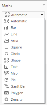
Change the Type of Mark in the View
You can change the type of marks displayed in the view to fit your analysis. For example, you can change the marks from bars to lines. This article describes how to change the type of marks used in the view, and explains the different types of marks available. For related information on marks, see Control the Appearance of Marks in the View and Marks card.
Change the mark type
To change the mark type:
On the Marks card, click the Mark Type drop-down and select an option from the list.
For descriptions of each mark type, see the following sections:
- Automatic mark
- Bar mark
- Line mark
- Area mark
- Square mark
- Circle mark
- Shape mark
- Text mark
- Map mark
- Pie mark
- Gantt Bar mark
- Polygon mark
- Density mark
When the Marks card drop-down menu is set to Automatic, Tableau automatically selects the best mark type for your data view. The mark type that is automatically selected is determined by the inner fields on the Rows and Columns shelves. The icon in the Marks card drop-down menu indicates which type of mark was automatically selected. The mark types below are automatically selected for the following scenarios.
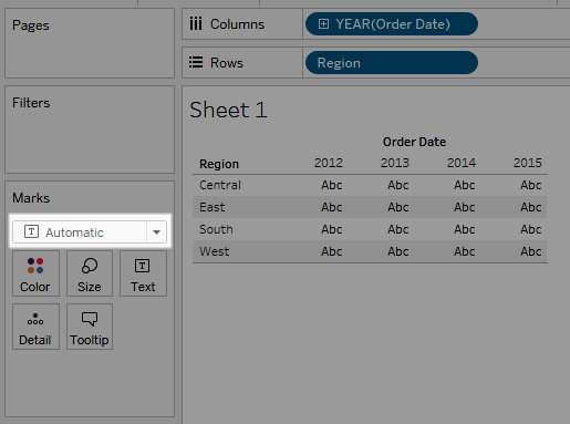
Text
The Text mark type is automatically selected when there are dimensions as inner fields on both the Rows and Columns shelves.
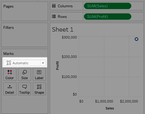
Shape
The Shape mark type is selected when there are measures as inner fields on both the Rows and Columns shelves.
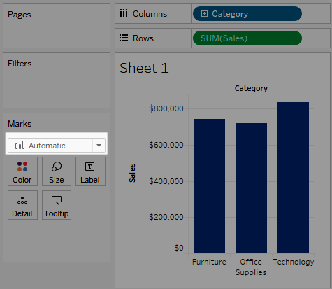
Bar
The Bar mark type is selected when there is a dimension and a measure as inner fields on Rows and Columns shelves.
Line
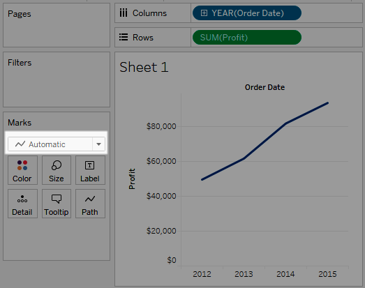
The Line mark type is selected when there is a date field and a measure as the inner fields on the Rows and Columns shelves.
Note: You can override the default selection and use any mark type that provides insight into your data. However, you should exercise some caution when manually selecting a mark type because the resulting view might hide important information about your data.
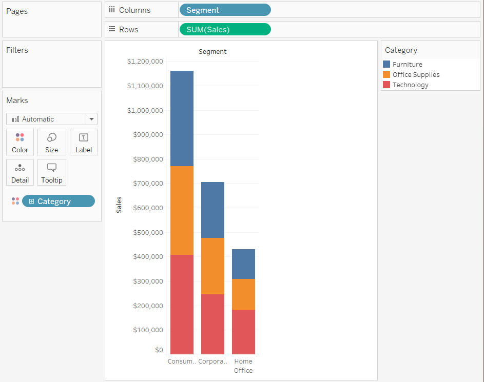
The Bar mark type is useful when you want to compare measures across categories, or when you want to break data down into stacked bars. Tableau displays your data using bars when:
The Marks card drop-down menu is set to Automatic, and you place a dimension and a measure as the inner fields on the Rows and Columns shelves. If the dimension is a date dimension, the Line mark is used instead.
You select Bar from the Marks card drop-down menu.
Marks are automatically stacked.
Note: For views where the mark type is Bar and there are continuous (green) fields on both Rows and Columns, Tableau supports additional options and defaults for sizing the bar marks on the axis where the bars are anchored. See the Continuous axis mark sizing section in Change the size of marks for details.
The data view shown below displays a dimension as the columns of the table, and a measure as the rows of the table. It is also color-encoded by a dimension (Category). Because the Marks card drop-down menu is set to Automatic, data is displayed using bars.
To try some hands-on exercises for building bar charts, see Build a Bar Chart.
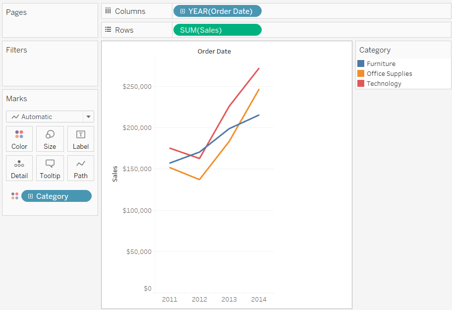
The line mark type is useful when you want to see trends in data over time, your data are ordered, or interpolation makes sense. Tableau displays data using lines when:
The Marks card drop-down menu is set to Automatic, and you place one or more measures on either the Columns shelf or the Rows shelf, and then plot the measures against a date dimension or a continuous dimension.
You select Line from the Marks card drop-down menu.
Note: In views that use the line mark type, you can use the Path property in the Marks card to change the type of line mark (linear, step, or jump), or to encode data by connecting marks using a particular drawing order. For details, see Path properties in the Control the Appearance of Marks in the View
The data view shown below displays a date dimension as the columns of the table and a measure as the rows of the table.
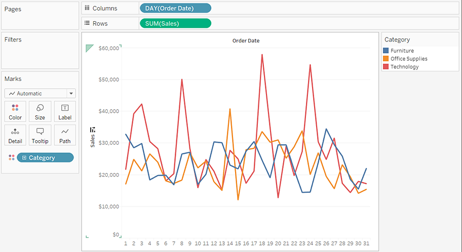
As the density of data increases, trends are often easier to see when using lines. This view shows 93 data points.
To try some hands-on exercises for building line charts, see Building Line Charts.
The Area mark type is useful when you have a view where the marks are stacked and do not overlap. For more information about stacked marks, see Stack Marks. In an area chart, the space between each line and the next line is filled with a color. This type of chart is not the best way to show specific values along the line but it can clearly show the total values so you can get an idea of how a dimension is contributing to an overall trend. Tableau displays your data using areas when:
- The Marks card drop-down menu is set to Automatic and one or more measures is plotted against a date dimension or continuous dimension. The Analysis > Stack Marks option must also be selected.
The view below shows a date dimension on the Columns shelf and a measure on the Rows shelf. Each line represents the sales for a product category. The lines have been stacked so that they do not overlap.
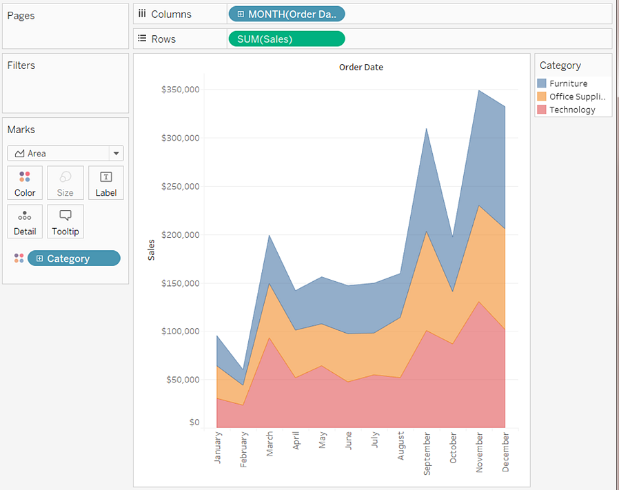
Note: You can add labels, edit the color legend, and highlight areas. In addition, you can turn on color effects, such as mark borders. For more information, see Control the Appearance of Marks in the View.
The square mark type is useful when you want to clearly see individual data points. When you select Square from the Marks card drop-down menu, Tableau displays your data using squares.
The view shown below displays several dimensions on both the rows and columns shelves. By default, the data is displayed using text. However, when you place a measure on Color, Tableau converts the marks to squares and creates a heat map. To try some hands-on exercises for building highlight tables, see Build a Highlight Table or Heat Map.
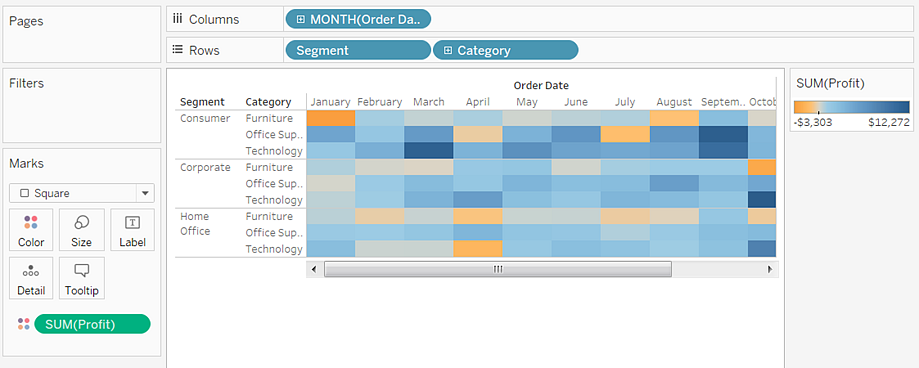
When you add additional levels of detail by placing a dimension on Detail, Color, Shape, Size, or Label on the Marks card, the squares are displayed side-by-side and wrap to fill the cell. If the window is too small to show all of the squares, an ellipses indicates that there are more values than you can see.
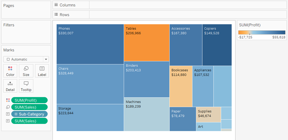
You can also use the square mark to create treemaps. A treemap displays hierarchical data as a set of nested rectangles. To try a hands-on exercise for building a treemap, see Build a Treemap.
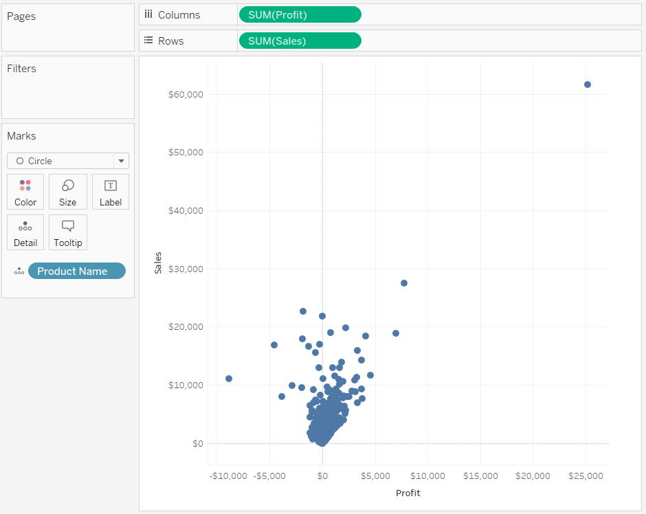
When you select Circle from the Marks card drop-down menu, Tableau displays your data using filled circles.
If the mark type was set to Automatic, Tableau would display the data using a shape (that is, an open circle).
The shape mark type is useful when you want to clearly see individual data points while also viewing categories associated with those points. Tableau displays your data using a shape when:
The Marks card drop-down menu is set to Automatic, and you place one or more measures on both the Rows and the Columns shelves.
You select Shape from the Marks card drop-down menu.
The view shown below displays the data from two measures. Because the Marks card drop-down menu is set to Automatic, the data are displayed using a shape.
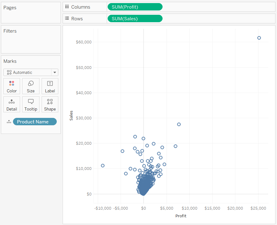
By default, the shape used is an open circle. To select a different shape, click Shape on the Marks card. Twenty unique shapes are available:
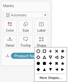
To add more data to the view, you can place a field on Shape on the Marks card. Tableau separates the marks according to the values in the field. If the field is a dimension, each member is assigned a unique shape. If the field is a measure, the measure is automatically binned into distinct buckets and each bucket is assigned a unique shape. The shape legend displays how shapes are distributed.
As shown below, the Ship Mode dimension is placed on Shape on the Marks card to encode each mark with information about how the order was shipped.
For details on how to build a scatterplot, see Build a Scatter Plot.
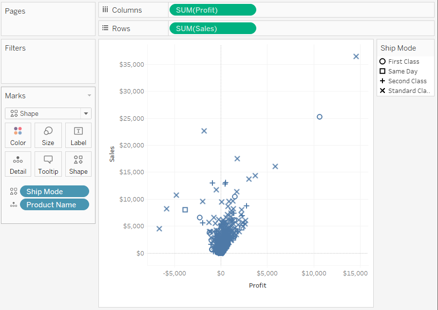
The Text mark type is useful when you want to display the numbers associated with one or more dimension members. This type of view is often called a text table, a cross-tab, or a pivot table. Tableau displays your data using text when:
The Marks card drop-down menu is set to Automatic, and you place one or more dimensions as the inner fields on both the Rows and the Columns shelves.
You select Text from the Marks card drop-down menu.
Initially, the data is displayed as Abc.
To complete the view, you must place a field (typically a measure) on Text on the Marks card. In the view below, the Sales measure, which is aggregated as a sum, is used to complete the table.
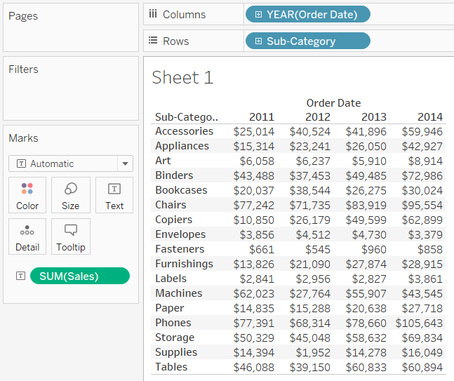
Note: To create a cross-tab of any data view, select Worksheet > Duplicate as Crosstab.
When you add additional levels of detail by placing a dimension on Detail, Color, Shape, Size, or Text on the Marks card, the values are shown side-by-side and wrap to fill the cell. Allowing the text to stack up makes it possible to create word cloud visualizations like the one shown below.
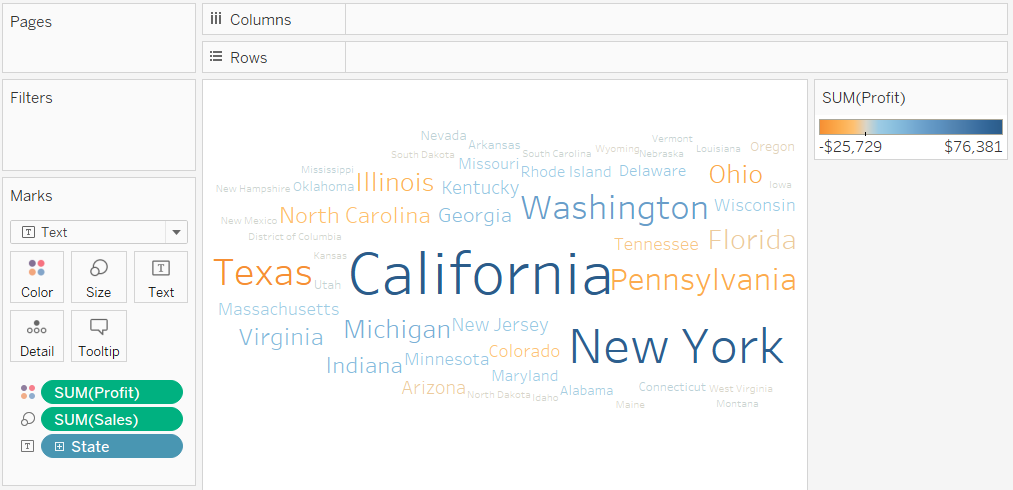
If the application window is too small for all of the text values, some of the displayed text values will be truncated.
If the application window is too small for all of the text values, the cell displays an ellipses to indicate that there are more values than can be displayed. Number values that can't be displayed are indicated with pound signs (#).
For details on how to build a text table, see Build a Text Table.
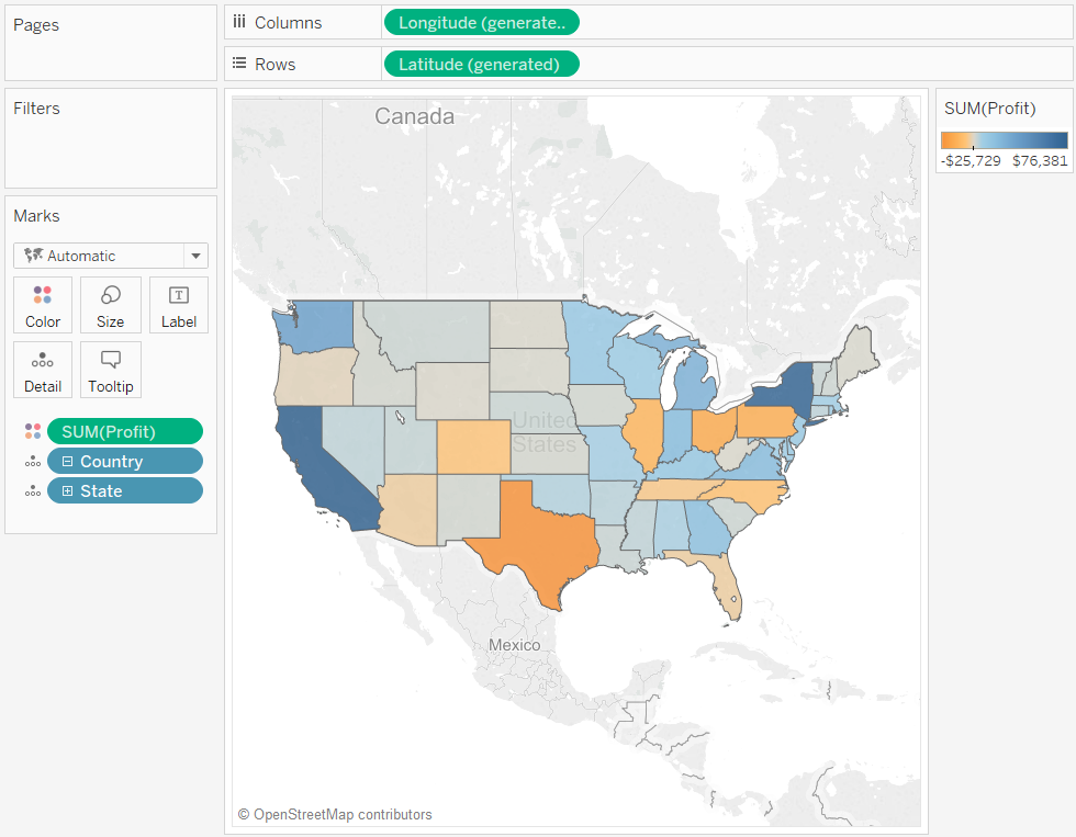
The Map mark type uses geocoding to fill a polygon or line with a color based on data. The primary use of the map mark type is for creating polygon or line maps. The area to be filled is defined by the geographic fields used in the view. Tableau displays data using a filled map when:
A geographic dimension is on Detail on the Marks card, along with Latitude and Longitude on the Rows and Columns shelves. A measure or continuous dimension is added to Color on the Marks card.
You select Map from the Marks card drop-down menu.
The data view below shows a map with the State geographic dimension on Detail on the Marks card. The Profit measure is on Color on the Marks card.
The polygon for each state is filled with a color based on the profit for that state. The profit in Texas is low (in fact, negative) while the profit in California is high.
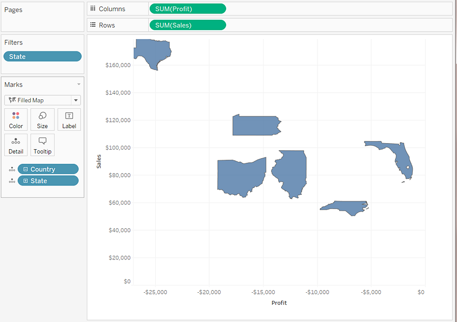
You can also use the Map mark type when you are plotting two measures against each other. By default, placing measures on both the Rows and Columns shelves creates a scatter plot. However, adding a geographic dimension allows you to change the mark type to Map. Each mark becomes the area defined by the geographic field. For example, the view below shows Sales versus Profit for a selection of states. Rather than showing a round mark with a label for each state, the view uses the Map mark type to draw the outline of each state. While this works well for recognizable areas, it is not the best choice for areas that are similar in shape or difficult to recognize.
For more details on building maps, see Get Started Mapping with Tableauand Maps and Geographic Data Analysis in Tableau.
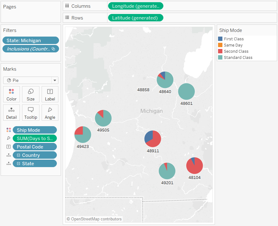
You can use the Pie mark to show proportions. Although generally this type of information can be better shown using stacked bar charts, there are cases where pie marks can be very effective—for example, when trying to convey the percentage allocation of marketing expenses by state where the spending of geographically close states are very relevant.
Tableau will never use the Pie mark as an automatic mark type, but you can select Pie from the Marks card drop-down menu.
When you select the Pie mark type, an additional target named Angle is displayed on the Marks card. The Angle target determines the angular measure of the pie wedges. For example, if you place a measure such as Sales on Angle on the Marks card, the 360 degrees of the pie corresponds to the total sum of sales, and each wedge is divided by the values of the field on Color on the Marks card.
The view below shows the time it took to ship products by various ship modes. The data overlays a map and shows data by state. We can see that standard class shipping takes the longest in most areas.
For details on how to build and use pie charts, see Build a Pie Chart and Get Started Mapping with Tableau.
The Marks card drop-down menu is set to Automatic and you place one or more dimensions on either the Columns shelf or the Rows shelf, and then plot the dimensions against a continuous quantity.
You select Gantt Bar from the Marks card drop-down menu.
The distinguishing characteristic of Gantt Bars is that the length of every mark is proportional to the measure placed on Size on the Marks card.
The view below displays a dimension as a function of a continuous date. If the Marks card drop-down menu is set to Automatic, the data would be displayed using bars. Selecting Gantt Bar and adding additional fields will display a view like the following.
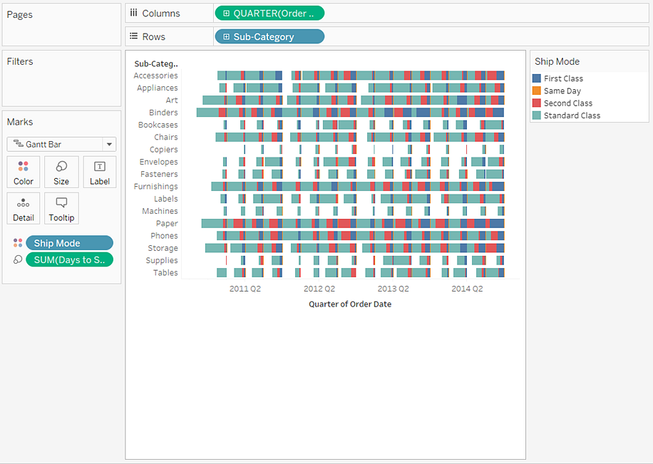
In particular, placing the Days to Ship measure on Size on the Marks card causes every bar in the view to be drawn with a length that indicates the delivery time of an order. Additionally, placing the Ship Mode dimension on Color on the Marks card causes each bar to be colored according to the ship mode.
For details on how to build Gantt Bar chart, see Build a Gantt Chart.
Polygons are points connected by lines enclosing an area. The polygon mark type is useful when you want to connect points to create data areas. Tableau displays data using polygons when you select Polygon from the Marks menu.
The polygon mark is not commonly used and often requires a specially constructed data source.
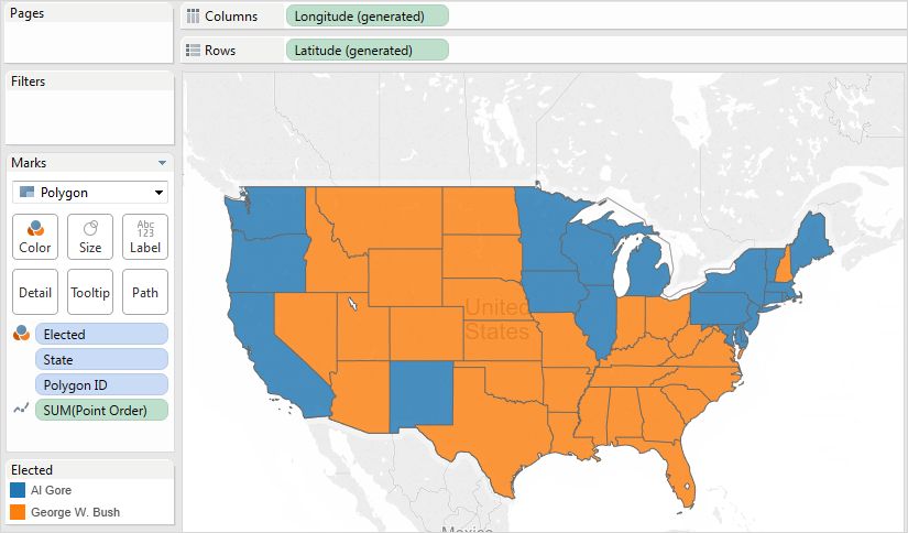
The view shown below comes from a specially constructed data source that holds geographic and election data. It displays the 48 contiguous US states as a function of latitude and longitude and color-encodes each state by the 2000 presidential election results.
If Marks is set to Automatic, the data will be displayed using a shape. Manually selecting Polygon and adding additional fields to the view causes a different view to be created.
 '
'
Every state is considered to be a polygon in the data source. The PolygonID field on the Detail target is distinct for each US state. You can remove states from the view by filtering this field.
Additionally, you can specify the drawing order of the lines that constitute each polygon by placing a field on the Path target. In this example, the PointOrder measure is used to draw each state.
You can use the density mark to visualize patterns or trends in dense data with many overlapping marks. Although generally this type of information can be shown using a circle mark, there are cases where density marks can be very effective—for example, when there are many data points in an area, and you need to understand where those marks are most concentrated. The density mark can be used effectively with maps or charts that use point-based marks (scatterplots, unit histograms, box plots over individual marks, or point maps).
Tableau does this by grouping overlaying marks, and color-coding them based on the number of marks in the group.
Density marks work by using color to show the relative intensity of data in a given area of the chart. You can adjust the colors of the density mark by selecting Color from the Marks card. Choose from ten density color palettes, or any of the existing color palettes.
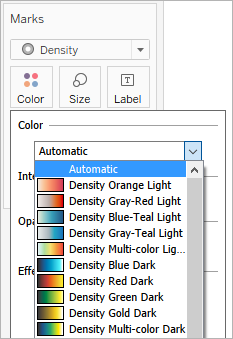
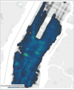
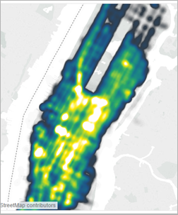
In the Color menu, use the Intensity slider to increase or decrease the vividness of the density marks. For example, increasing intensity, or vividness, lowers the "max heat" spots in your data, so that more appear.
| Low Intensity (50%) | High Intensity (80%) |
 |  |
The view shown below comes from a data source that contains many geographic points for one month of taxi pickups in Manhattan. It displays the location and frequency of taxi pickups, with lighter colors being most frequent.
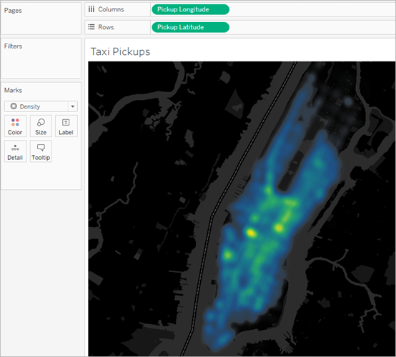
You can select Density from the Marks card drop-down menu.
For details on how to build a density map or a density chart, see Create Heatmaps that Show Trends or Density in Tableau and Build with Density Marks (Heatmap).